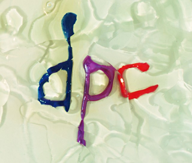
lettering is acrylic paint, above it is 3 layers of cd case with a differnt oil on each level (washing up liquid, chain oil and liquid soap. Its a variation on the Ye Olde Watere Dropes thing.
Statistics
Place: 157 out of 202 Avg (all users): 4.2222 Avg (commenters): 4.7143 Avg (participants): 4.2232 Avg (non-participants): 4.2212 Views since voting: 860 Votes: 216 Comments: 8 Favorites: 0
Your picture meets the challenge. I always marvel at all the different things that people think of for the different challenges! I must say that your idea is quite interesting as an idea. Unfortunately, outside of DPChallenge this photo would not "ring a bell" with many people. IMHO even here at DPC it probably is not a photo that will grab many viewer's attention for more than a moment.
I like the colour and the "plastic" look of the letters. IMO, the background (or foreground) is quite interesting, but it might work better if it were sharper, the colours were brighter, and there was a bit more contrast.
Overall, I think this is a good idea and a "gutsy" entry to the challenge. BTW, I love your picture for "From Above" ("Haft Empty or Haft Full"). Take care,
personally, I don't like the lettering..... I think you could have perhaps created a better design with the paint, I think this would have worked better with the surface oil(?) to create that disjointed effect...... good luck, Todd.





 Add photograph to your favorites
 Add photographer to your favorites


