| Author | Thread |
Comments Made During the Challenge  |
|
|
10/01/2005 10:56:52 AM |
|
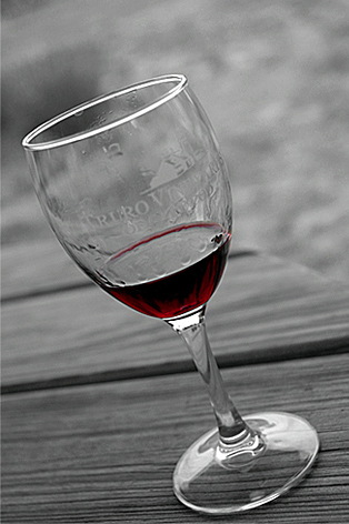
I like the contrast btw the b&w and the vibrant wine. I can't decide if I like the tilt here or not. |
|
|
|
10/01/2005 05:43:59 AM |
i like how there is black and white then the crimson it is creative
and i also like how it is on a slope it is also very very good |
|
|
|
09/30/2005 11:18:38 PM |
|
i like this - simple and classy, like the coloring with B&W |
|
|
|
09/29/2005 03:29:07 PM |
|
This is a nice picture ... great concept ... the glass seems to be dirty though :( |
|
|
|
09/29/2005 02:15:59 PM |
|
I like the color effect, but the tilt plays with my mind. |
|
|
|
09/29/2005 12:05:07 PM |
|
My first reaction was - "don't let it fall off". The angle is a bit too much for me. I wish there was a bit more light overall. Without the red of the wine this is almost a monochrome or black and white photo (that's not necessarily a bad thing). For me, having another element somewhere in the photo would add interest. |
|
|
|
09/28/2005 10:02:59 AM |
Not sure about the angle of the shot, though it did evoke emotion as I was tempted to catch the glass from falling, on first glance :)
I do like the red wine against the grey, though I find the writing on the glass takes away from the simplicity of this shot a little. |
|
|
|
09/28/2005 09:27:54 AM |
Very Pretty,But There Two Things I Want To Comment On:
1) The Angle Is Too Steep...Looks Like You Took The Picture In San Francisco Or Something
2) The Lettering That's Etched On The Glass Is Distracting...It Does Not Work Well With B&W |
|
Home -
Challenges -
Community -
League -
Photos -
Cameras -
Lenses -
Learn -
Help -
Terms of Use -
Privacy -
Top ^
DPChallenge, and website content and design, Copyright © 2001-2026 Challenging Technologies, LLC.
All digital photo copyrights belong to the photographers and may not be used without permission.
Current Server Time: 06/28/2026 07:30:24 PM EDT.