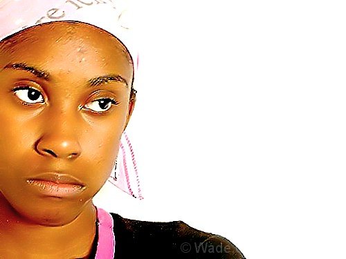
Good use of the rule of thirds, but I think the white background spoils it. There's white and there is white, and this white doesn't flatter her skintones. Also, her head loses definition because the scarf blends into the white background.
I like this image, the direction she is looking is perfect and I like the negative space BUT her face doesn't seem as sharp as it should be. I think it had a lot of potential if it weren't for that.
I like this, but the shot seems slightly out of focus - particularly her upper face. The lighting seems a bit harsh as well. Maybe use the unsharp mask tool to sharpen up her facial features. Her expression is sort of resigned discouragement. This model has nice features. Maybe the skin tone is a touch too yellow.







 Add photograph to your favorites
 Add photographer to your favorites

 Photographer found comment helpful.


