| Author | Thread |
|
|
06/09/2003 01:02:08 PM |
*Critique Club*
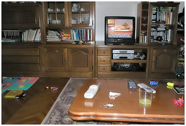
This definately is representive of home, but I don't really see how it's creative. Looks like you were sitting on your couch, realized you needed a shot, reached over, grabbed the camera and shot. You say that it's creative, but I'm not seeing the creativity part.
The focus appears to be really soft throughout the photo as well. I can't even identify 3 of the items on the table, and the others are really soft focus. The items on the floor and on the shelves are also soft focus. Selective focus works sometimes, but I don't think it adds anything of interest at all here.
The angle and framing/cropping need some work too. The whole shelving unit/entertainment stand thing is leaning to the right. Looks like everything should slide off the shelves and out of the right of the photo.
The lighting in my opinion is also poor. There is what looks like a flash reflection in the Television set, and on this side of the table as well. I am wondering if the lighting is contributing to there being nothing in sharp focus. Sometimes when there isn't enough light, it hurts the focus.
It does fit the challenge, definatly your home, but I think it simply lacks 2 things, focus and a point of interest.
~Heather~ |
|
Comments Made During the Challenge  |
|
|
06/03/2003 05:35:17 PM |
|
Maybe I'm wrong, but I get the feeling that this picture was not taken during the week of submital based on the war coverage that is on the TV. oH well, doesn't bother me any. |
|
|
|
06/03/2003 02:59:41 PM |
|
Ugly photo, but my idea of HOME :-) Kid's toys, remotes strewn, telephone, videocassettes, and the tv going, although looks like CNN?? Make it Foxnews, and I'm there :-) |
|
|
|
06/03/2003 01:43:17 PM |
|
The clutter make the home looked lived in. NIce job. |
|
|
|
06/03/2003 11:15:50 AM |
|
Nice to see a 'normal' house! |
|
|
|
06/02/2003 07:58:03 PM |
|
mine is much worse! and i dont have kids... |
|
|
|
06/02/2003 06:04:22 PM |
|
very literal interpretation of the challenge. I think you used your flash here, which has the effect of being too bright in the foreground, leaving the rest of the shot looking dark. Nothing else really wrong with it, except that its not the most rivetting composition. I think that will probably explain your placement more than anything. There just isn't any interest in the shot besides a documentation of your livingroom. :) (lovely and cosy though it seems!) |
|
|
|
05/30/2003 04:39:37 PM |
|
Well...... it's indeed home, I suppose. But I have to be honest in saying that it doesn't appear that there was a lot of thought put into this one. It just looks as though you suddenly remembered that you wanted to submit a shot, and this was the first thing you saw. Sorry... |
|
|
|
05/30/2003 01:36:10 AM |
|
I would try coming at this from a hgher location, play with lighting and crop it a bit more so you are not trying to capture so mcuh. It's too busy to make sense. |
|
|
|
05/29/2003 10:34:03 PM |
|
Mess is how I would describe this picture |
|
|
|
05/29/2003 04:07:49 AM |
|
Next time try not to use the flash, but try to use a longer exposure time. That way the colors and the light will be much better. For now the light is too harsh. |
|
|
|
05/28/2003 09:45:42 PM |
|
|
|
05/28/2003 01:38:22 PM |
|
You call that a mess!?!?! |
|
|
|
05/28/2003 01:08:21 PM |
|
Home -
Challenges -
Community -
League -
Photos -
Cameras -
Lenses -
Learn -
Help -
Terms of Use -
Privacy -
Top ^
DPChallenge, and website content and design, Copyright © 2001-2026 Challenging Technologies, LLC.
All digital photo copyrights belong to the photographers and may not be used without permission.
Current Server Time: 06/27/2026 01:47:59 PM EDT.