| Author | Thread |
|
|
09/10/2005 02:22:30 PM |
|
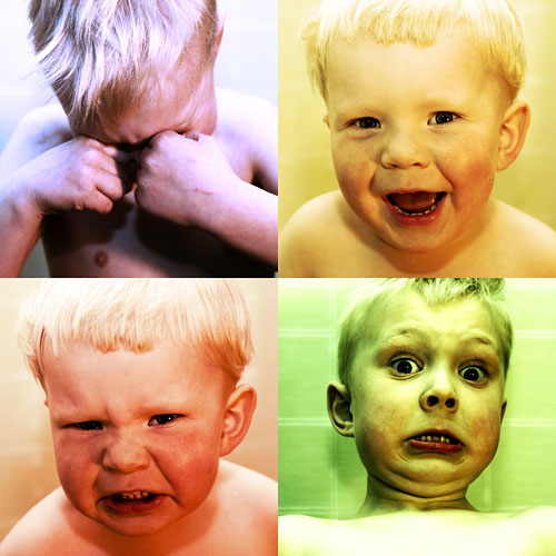
Again, love the presentation! I would suggest that the bottom left and top right are perhaps a bit too close in tone and expression/crop to fit in with the other two. Very cool... |
|
 Photographer found comment helpful. Photographer found comment helpful. |
|
|
09/10/2005 02:01:37 PM |
|
Not sure! I don't find them attractive but then that is probably not the point. I wouldn't have them on the wall. Not sure a baby suits this style. Right, now the style I like and with the right subject and a tad darker colour this could be very effective. Backgrounds should be the same and subject perhaps a little sharper. My opinion although I am very far from an expert so I hope you don't mind my imput! |
|
| Photographer found comment helpful. |
|
|
09/10/2005 02:01:31 PM |
|
For some reason, the green one doesn't seem to work here for me. It might be the wall, it might be the blown out part of the chest. The expression is also a little odd I think. Anyway, I really like all the rest of it. Did you ask your "model" to just make funny faces or what? I'll be he thinks it's fun too. |
|
| Photographer found comment helpful. |
|
|
09/10/2005 10:51:54 AM |
|
On these I would proub darken the color a tad. And maybe try to get rid of the lines on the wall in the green one. |
|
| Photographer found comment helpful. |
Home -
Challenges -
Community -
League -
Photos -
Cameras -
Lenses -
Learn -
Help -
Terms of Use -
Privacy -
Top ^
DPChallenge, and website content and design, Copyright © 2001-2026 Challenging Technologies, LLC.
All digital photo copyrights belong to the photographers and may not be used without permission.
Current Server Time: 07/06/2026 01:10:15 PM EDT.