| Author | Thread |
|
|
09/21/2006 09:57:51 AM |
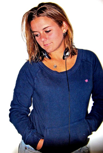
i am not sure why this picture scored low,
i personally like it a lot. i think it's the fact that you are being yourself in that picture.
anyhow good job:) |
|
 Photographer found comment helpful. Photographer found comment helpful. |
|
|
09/22/2005 06:13:55 PM |
Critique Club Comment:
Different but interesting, that was my initial reaction when I got this photo to critique.
The model, you, poses in a somewhat unposed way, if you know what I mean.
You look a bit bored, or careless about somebody (you) taking the picture. Loose could maybe be a good word to describe it.
That's what I like about this photo.
On the other hand, there's a shadow at the bottom that could have been easily cropped off.
It didn't score that well, in a challenge with so many good shots, and I can tell you a bit about why.
DPC as you know, is a strange unpredictable community, but not that unpredictable.
There are a few nono's on this site. And one of them is post processing in a different way then we are used too.
The colors of your photo are weird or strange or whatever comments people made about it.
There is grain, and it doesn't look clean.
Does that mean it's bad? NO!!! It just means that DPC will score you lower.
Personally I would have done something completely different, because I know DPC voters a bit and I am scared of them. I always try to please them, and think about it many times before daring to submit something different or out of the box.
Does that make me a good photographer? No!
So that's why I like people that dare to be different, and that's why I like this sot.
Congrats on a wonderful self portrait.
Peter |
|
Comments Made During the Challenge  |
|
|
09/17/2005 08:52:45 PM |
|
Good portrait. A little over-processed perhaps. I'm still learning, so trust the other comments more than mine. But she looks like a little off-focus that you tried to sharpen. |
|
|
|
09/17/2005 05:34:27 AM |
|
A lovely girl, and not a bad concept. The lighting feels harsh and uneven, and your model doesn't really look comfortable in the shot. I like the simplicity of the white background. |
|
|
|
09/16/2005 08:54:53 PM |
|
i think this picture lacks some interaction. i would shoot at a weird angle and have the model do some pose that provokes a sense of movement. |
|
|
|
09/15/2005 09:34:18 PM |
|
The skin tones seem to have a bit of an orange cast, but I like the composition and casual pose. |
|
|
|
09/15/2005 12:04:03 PM |
Love the pose.
This is an interesting picture
I have voted on this picture 3 times now, each time bumping up.
You are currently on a 9, this could change. I love the grain, i love the pose, the smile is Da Vinchi like. Just a stunning shot. There are a few technical things wrong, but the bear into nothing compared to the composition and stuff.
Well done.
And good luck. I would love to see this finish top 10, but i'm just not sure if the DPCers will spend enough time looking into the meaning and message here.
Kev |
|
|
|
09/14/2005 12:53:32 AM |
|
I love the way you shot this, the colors are really nice. |
|
|
|
09/13/2005 10:40:35 PM |
lots of yellow in skin tones.. also flash dropoff at bottom, maybe crop would have been better 5
|
|
|
|
09/13/2005 12:16:32 PM |
|
I would like to see her face more in focus |
|
|
|
09/12/2005 05:47:53 PM |
|
Good capture of an attitude. |
|
|
|
09/12/2005 03:03:24 PM |
|
I don't care for the skin tones in this shot....her neck looks orange and face looks pinkish-gold. If the lighting on the face were more even, this would be a much more effective shot. |
|
Home -
Challenges -
Community -
League -
Photos -
Cameras -
Lenses -
Learn -
Help -
Terms of Use -
Privacy -
Top ^
DPChallenge, and website content and design, Copyright © 2001-2026 Challenging Technologies, LLC.
All digital photo copyrights belong to the photographers and may not be used without permission.
Current Server Time: 07/02/2026 05:35:20 AM EDT.