| Author | Thread |
|
|
10/19/2003 10:58:52 AM |
|
thanks a lot for all your helpful comments! |
|
Comments Made During the Challenge  |
|
|
06/03/2003 08:11:30 PM |
|
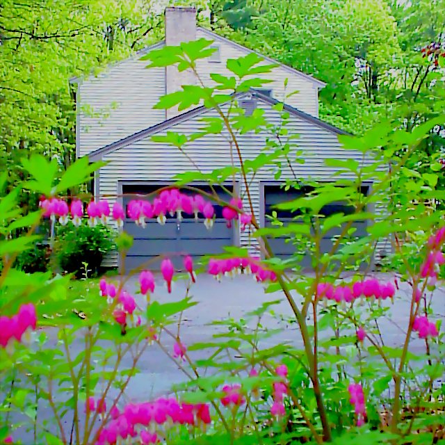
I would suggest turning the color down just a hair. it’s a little distracting |
|
 Photographer found comment helpful. Photographer found comment helpful. |
|
|
06/03/2003 04:55:08 PM |
|
WHOA!!! Tone the colors down! The colors being displayed are great but they are over powering. |
|
| Photographer found comment helpful. |
|
|
06/03/2003 04:36:18 PM |
|
Too much out of foreground blurs the photo. |
|
|
|
06/02/2003 08:34:19 PM |
|
nice idea..the flowers are really blurry though |
|
|
|
06/02/2003 08:34:05 PM |
|
way too oversaturated and dithered. it is painful to look at. |
|
| Photographer found comment helpful. |
|
|
06/02/2003 12:41:07 PM |
|
that green is too much... too much saturation. |
|
|
|
05/30/2003 04:42:01 PM |
|
Not bad. The color seems to be a little too saturated. |
|
| Photographer found comment helpful. |
|
|
05/30/2003 12:08:54 PM |
|
i really like the colour contrast of yellow/green and pink. 9 |
|
| Photographer found comment helpful. |
|
|
05/29/2003 10:30:32 PM |
|
|
|
05/29/2003 02:53:23 PM |
|
too much green!!!!!!! Try desaturating this a bit and it'd work quite nicely. As it is - overloads the eyes a little. |
|
| Photographer found comment helpful. |
|
|
05/29/2003 01:31:08 PM |
|
to many bright colors in the front it takes away alot of intrest from your picture nice work. |
|
| Photographer found comment helpful. |
|
|
05/29/2003 02:55:29 AM |
|
the colours are blinding me! |
|
|
|
05/28/2003 05:08:12 PM |
|
think it would have looked better without the plants in the foreground |
|
|
|
05/28/2003 02:12:45 PM |
|
| Photographer found comment helpful. |
|
|
05/28/2003 09:08:15 AM |
|
Wooooo I need my shades for this one! I think you went a little overboard on the saturation there! :o) |
|
| Photographer found comment helpful. |
|
|
05/28/2003 03:09:29 AM |
|
A bit too much sugar in those colours. |
|
|
|
05/28/2003 02:44:42 AM |
|
green looks oversaturated? |
|
| Photographer found comment helpful. |
|
|
05/28/2003 01:56:02 AM |
|
Your Bleeding Hearts look like tiny bells, barely defocused. I like it! |
|
| Photographer found comment helpful. |
|
|
05/28/2003 01:47:31 AM |
|
I would have focused on your bleeding hearts instead of the house, they are the more interesting subject IMO. Nice color and clarity. |
|
| Photographer found comment helpful. |
|
|
05/28/2003 01:33:25 AM |
|
Too colorful,it hurts my eyes,picture is overexposed,4 from me! |
|
Home -
Challenges -
Community -
League -
Photos -
Cameras -
Lenses -
Learn -
Help -
Terms of Use -
Privacy -
Top ^
DPChallenge, and website content and design, Copyright © 2001-2026 Challenging Technologies, LLC.
All digital photo copyrights belong to the photographers and may not be used without permission.
Current Server Time: 06/28/2026 09:15:07 PM EDT.