| Author | Thread |
Comments Made During the Challenge  |
|
|
09/13/2005 11:04:16 PM |
|
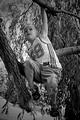
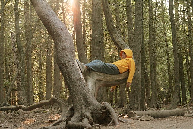
nice shot cool how u found a trtee like that |
|
|
|
09/13/2005 12:29:29 PM |
|
|
|
09/13/2005 01:09:59 AM |
|
hehehe this is awsome...love the idea...must have took a while to find that tree |
|
|
|
09/12/2005 06:17:02 AM |
|
|
|
09/12/2005 02:00:24 AM |
|
Lovely image and nice idea...but your model looks bored and uncomfortable... the facial expression and bodyposition really detract from the photo. Also given the somewhat muted and and rather understated lighting and colors, his yellow hoodie make him stand out too much (IMHO) |
|
 Photographer found comment helpful. Photographer found comment helpful. |
|
|
09/11/2005 07:41:51 PM |
|
Great idea to introduce a human element to the scene. |
|
|
|
09/10/2005 11:13:42 PM |
|
the sun kind of bothers me i would have brought up the contrast a little to compensate for the washing out that most of these kind of captures have |
|
|
|
09/10/2005 09:46:12 AM |
|
Good exposure, dof, light. I wonder if the composition would be even better if the subject wasn't in the center -- tho I'm not sure about that in this case. Nice job! |
|
|
|
09/10/2005 09:35:55 AM |
|
Seems a little unsaturated? maybe you did it on purpose, pretty neat. |
|
|
|
09/09/2005 04:42:44 PM |
|
Great idea and great tree! I think a little more contrast or playing with post processing to get the greens to stand out a bit would have helped you get a much higher score. |
|
|
|
09/09/2005 06:57:53 AM |
|
Use of the rule of thirds would enhance the images total impact, good job though |
|
|
|
09/08/2005 10:01:53 PM |
|
Looks like a good thinking spot. |
|
|
|
09/08/2005 04:08:14 PM |
|
It would have been really neat if your "model" could have been robed or wearing something you would see in Lord of the Rings as this setting has a mystical feel to it. |
|
|
|
09/08/2005 02:12:23 PM |
|
could have used more contrast, but I like it anyways. |
|
|
|
09/08/2005 01:20:35 PM |
|
The flare in lens barrle drops the contrast and viacity of the colors. either shooting in shadow or pushing them back up in post processing would have helped. the trees on either side don't add much to the composition, did you concider a squarer crop? i like the basic line of the shot but it could have been made stronger. |
|
|
|
09/08/2005 12:07:35 AM |
|
I wish your subject was a little bit more interesting, but he's kind of bland. You could have done alot more with that awesome tree, maybe use a smaller person. Also, honing in on more of the tree and less of the woods would have helped too. |
|
| Photographer found comment helpful. |
|
|
09/07/2005 11:08:03 PM |
|
I found a tree like that once... Perfect spot .. i like the sun sneaking in through the tops of the trees. |
|
|
|
09/07/2005 08:58:10 PM |
|
Looks like it needs slightly hogher contrast, but a great composition. 6 |
|
|
|
09/07/2005 07:20:00 PM |
|
very cool idea...and tree. i think with some tweaking of the colors, it could be a fantastic picture. |
|
|
|
09/07/2005 05:22:12 PM |
|
|
|
09/07/2005 01:28:18 PM |
|
What a GREAT capture! I do wish the tones were more interesting though, because you really spotted a unique find. I think it would work better with some more color, contrast, and a slightly offset crop - but that's just my opinion. Still, solid entry. |
|
|
|
09/07/2005 11:38:05 AM |
|
|
|
09/07/2005 11:30:45 AM |
|
nice photo, imo, cropping out the sun adds to the photo along with just a couple trees cropped on the right, moving the model more off center |
|
| Photographer found comment helpful. |
|
|
09/07/2005 10:35:45 AM |
|
HA HA, looks like my kids when I am struggling to set up camp! |
|
|
|
09/07/2005 07:03:11 AM |
|
I like this a lot. I wonder if it would have been even stronger if it were a portrait instead? |
|
| Photographer found comment helpful. |
|
|
09/07/2005 05:24:45 AM |
|
this is a rather good photo to work with, actually. the colours could be stronger (saturation) and you could have given it a more dramatic effect should you have played with the curves and layers a little. nice composition! |
|
| Photographer found comment helpful. |
Home -
Challenges -
Community -
League -
Photos -
Cameras -
Lenses -
Learn -
Help -
Terms of Use -
Privacy -
Top ^
DPChallenge, and website content and design, Copyright © 2001-2026 Challenging Technologies, LLC.
All digital photo copyrights belong to the photographers and may not be used without permission.
Current Server Time: 06/28/2026 06:33:32 PM EDT.