| Author | Thread |
Comments Made During the Challenge  |
|
|
06/16/2002 08:04:00 AM |
|
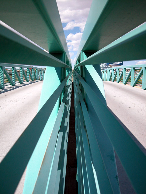
Excellent shot. The sign is distracting on the right side. It detracts from overall photo. Understand that not much choice when taking shots like these. That is only downside. Great color and camera angle is done well to show converging lines. |
|
|
|
06/15/2002 09:17:00 PM |
|
I would like to have seen more of that sky. The symetry works good here. |
|
|
|
06/14/2002 11:12:00 PM |
|
|
|
06/14/2002 10:27:00 PM |
|
Excellent structural photo, very strong composition. If those billboards weren't in the background it would be a lot cooler, but you couldn't change that :). |
|
|
|
06/14/2002 03:56:00 PM |
|
Cool abstract. I especially like the piece of sky that looks like it's been wedged in there at the top. My top 10 this week. |
|
|
|
06/14/2002 03:07:00 PM |
|
|
|
06/13/2002 11:59:00 PM |
|
|
|
06/13/2002 02:17:00 PM |
|
Great symmetry and it just draws you into the picture. The colors work well too. The only gripe I have, and I recognize that it is out of your control, is the billboard on the right, on the right. Other than that, I really like this picture. |
|
|
|
06/13/2002 01:05:00 PM |
|
I love the angles and the symmetry in this photo... The colors and contrasts are also very appealing to me. The only minor detail that I see (not affecting score) is the signs on the right.. That small amount of darkness tosses the symmetry off just a tiny bit... excellent shot! |
|
|
|
06/13/2002 12:57:00 AM |
|
Wow, great effect....Are you standing between the roads on the bridge?? |
|
|
|
06/12/2002 09:21:00 PM |
|
Intense! I'm glad you didn't drop your camera down that chasm! |
|
|
|
06/12/2002 09:07:00 PM |
|
Super geometric design your bridge makes. Nice dof, |
|
|
|
06/12/2002 08:35:00 PM |
|
|
|
06/12/2002 05:20:00 PM |
|
this is cool, even with the outlet mall signs. really nice design. |
|
|
|
06/11/2002 10:18:00 PM |
|
This is definitely unique. How did you get in there? ;) I like it! |
|
|
|
06/11/2002 05:49:00 PM |
|
An interestingly different view of a bridge. Part of me likes the geometry of this shot, but I also like to see "interest" in a photo, some reason to want to view it. No suggestions, but thought you should know. Photo 8 Creativity 9 Road 8 total 8 |
|
|
|
06/11/2002 05:39:00 PM |
|
Interesting, almost abstract. I find the dark lines down the center rather distracting. I find myself wondering how you got your camera where it appears to be. |
|
|
|
06/11/2002 04:12:00 PM |
|
Very cool shot with great lines |
|
|
|
06/11/2002 04:08:00 PM |
|
The best of the bridge photos. Nice abstract, yes i like this. I would have been tempted to paint out the signs in the top right quarter as they unbalance the shot a bit. |
|
|
|
06/11/2002 12:55:00 PM |
|
|
|
06/11/2002 11:36:00 AM |
|
|
|
06/11/2002 11:17:00 AM |
Very cool composition/concept. The lines almost jump out of the picture at the viewer. Looks like a tight space, how'd you manage to fit in there? ;)
Only complaint I've got is that sign just viewable through the right side. I know it was probably unavoidable; it just takes a little of the symmetrical feeling away. |
|
|
|
06/11/2002 10:28:00 AM |
|
great leading lines -- i'm wondering if the shot would've looked better landscape style? it seems a bit too tall because of the bottom. |
|
|
|
06/11/2002 09:23:00 AM |
|
|
|
06/11/2002 04:18:00 AM |
|
This would be an average illustration for a 70's sci-fi novel, but as an actual photograph... wow! I mean, WOW!!! |
|
|
|
06/11/2002 03:47:00 AM |
|
|
|
06/11/2002 01:36:00 AM |
|
should be a little darker, and more saturated. |
|
|
|
06/10/2002 09:14:00 PM |
|
Mesmerizing. Great idea. Great use of lines. In my top 5. |
|
|
|
06/10/2002 09:14:00 PM |
|
|
|
06/10/2002 08:04:00 PM |
|
|
|
06/10/2002 07:50:00 PM |
|
Nice symmetry and perspective. I would have liked it better if not for the signs on the right side. |
|
|
|
06/10/2002 05:38:00 PM |
|
Very nice lines, perspective. |
|
|
|
06/10/2002 05:24:00 PM |
|
Very good graphic, well executed. |
|
|
|
06/10/2002 03:22:00 PM |
|
|
|
06/10/2002 01:23:00 PM |
|
Neat patterns. Too bad about those signs to the right, though. |
|
|
|
06/10/2002 11:06:00 AM |
|
interesting angle...how'd you get this without getting run over? |
|
|
|
06/10/2002 05:14:00 AM |
|
This is an awesome compositon except the signs bug me coz the draw away to much attention. |
|
|
|
06/10/2002 12:11:00 AM |
|
Great shot. I'd consider it an abstract had you gotten the signs out of it on the right side. |
|
Home -
Challenges -
Community -
League -
Photos -
Cameras -
Lenses -
Learn -
Help -
Terms of Use -
Privacy -
Top ^
DPChallenge, and website content and design, Copyright © 2001-2026 Challenging Technologies, LLC.
All digital photo copyrights belong to the photographers and may not be used without permission.
Current Server Time: 06/28/2026 03:30:09 AM EDT.