This is just a sad attempt to enter the challege as i havent found any topic to my fancy yet.Took this on the weekend while winetasting in Stellenbosch.
Statistics
Place: 53 out of 432 Avg (all users): 5.8522 Avg (commenters): 6.8125 Avg (participants): 5.6531 Avg (non-participants): 6.0556 Views since voting: 1195 Views during voting: 435 Votes: 291 Comments: 20 Favorites: 0
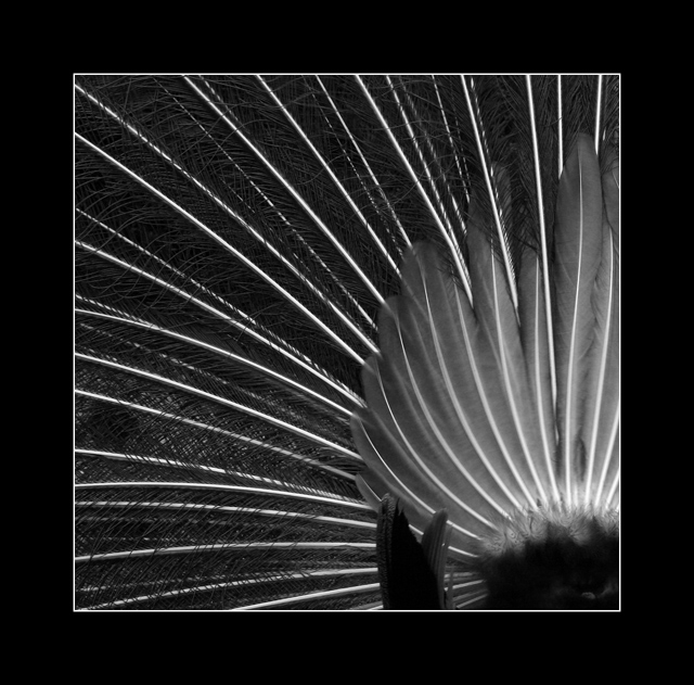
Pros: I love the contrast and sharp lines. The feathers 'branch' out nicely for a welcome creative twist on the challenge. Focus and DOF are very good. I noticed a commenter or two below that felt the focus was soft - on the contrary it is very sharp as the long feathers have very sharp edges and detail - the smaller feathers are fluffy on a peacock and should look soft. I think you did a great job.
Cons: The small dark clump of feathers in the lower right bottom section are distracting. Not the one in the corner - but the ones further in.
Interesting. I'm wondering why you decided to go B/W with a peacock.(To better show the "branching" ?) It sort of like that as it's unexpected with a peacock. Good amount of detail in the feathers.
Bottom middle/right feathers jutting up slightly jarring from the over all feel/flow.
And I'm not sure I like how very large the border is. A border works well with this. That one just seems just a little big.
I bet you knew you were going to get lots of "BORDERS TOO BIG" comments! well i kinda like it, well done for having the balls to do it. BTW I like the photo too ;)
I like the new take on an old classic. I think the border is a bit large, but the shot is great. Nice contrasting tones and good focus. Very appealing composition too.





 Add photograph to your favorites
 Add photographer to your favorites


 Photographer found comment helpful.


