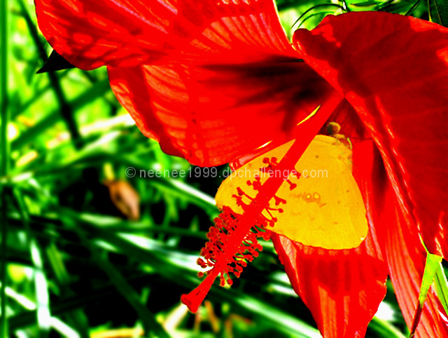
With the red and green you definitely have some contrast. For my untrained eye though, the red almost seems...too fake or overly done in a photo editing program.
Love the colros, not sure if the hot spots on the hibiscus are from the level adjustments, but is a bit distracting. Still a wonderful shot EDIT-- Bumped to a 7
Fit Challenge Criteria: 2/2
Color/Contrast: 0/2
Composition: 1/2
Photo Quality: 0/2
My Subjective Affinty: 0/2
These colors are way over saturated so almost all detail is lost. I'm looking at a red silhouette. It's kind of weird. I can't see a whold lot of focus anywhere in the photo.






 Add photograph to your favorites
 Add photographer to your favorites


 Photographer found comment helpful.


