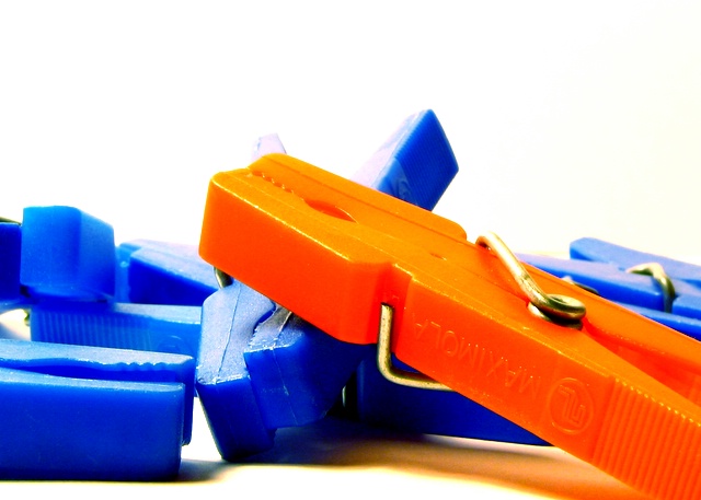
Hmmmm....I read the title, but unfortunately...the red clip looks really, really orange on my screen. Good contrasting colors though and nice, simple composition.
on the monitor I'm using, that pin is very much orange... doesn't change the effectiveness/contrastiness of the image, but it makes me think you should check your color calibration (either that, or I should!)
For me (and I have well calibrated display) then this look like orange, blue and white... but ok idea ... not one of the best photo in the challenge but I think you will do better next time ...
I find the subject in the photo lacks interest/subject. It is a nice macro shot but not one I'd hang on my wall. It does fit the challenge but fitting the challenge isn't everything. However it does have great clarity and the colors do POP. Good luck in this challenge. <5>







 Add photograph to your favorites
 Add photographer to your favorites


 Photographer found comment helpful.


