| Author | Thread |
|
|
09/15/2005 01:54:34 AM |
Greetings from the Critique Club
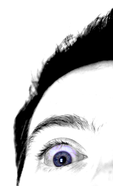
First Impression - when I saw the image, it was exactly as what you intended OMGWTF
Most of the comments I will leave you are from my humble opinion only. Let's get started shall we?
Composition:
This image rehashes images of the famed Blair Witch Project. I do like the "one eye" crop as opposed to perhaps both eyes within the frame of the shot. The image would probably be more powerful had you used the rule of thirds for the crop. IMHO, since the eyes are the major subject of this image, I think they are situated too low from the third line horizon.
Camera Work:
I do like the fact that you used the aperture you specified here. This focuses all my attention to your eyes then your brows and the rest just fades into the background. Kudos to you. The straight shot is also great as opposed to a "tilted" shot. I don't think it would have the same power and drama as this one portrays.
Post-processing:
Great job on the selective desat on this image. As my eyes look at the image and slowly moves around it, my eye is almost always drawn to your blue gray eyes. I am not certain if you really have this natural eye color as I can see traces of brown and amber as I look closely at it. The veins are something I'm not particularly too keen at - again, just my opinion. It's probably because the veins are colored and not desaturated. Had they been, then it wouldn't be too much of slight distraction.
I think the highkey approach here is excellent. I adjusted the balance on the brightness and contrast and there is definitely no other distracting elements within your composition.
Great job on burning your eyelashes and eyebrows. I think it adds more depth and texture to your image.
My Final Thoughts:
This image meets the challenge in my opinion and your title is on the mark. I believe it is a great image that portrays power, emotion and disbelief. Great decision on not adding a border to this image as I agree, it would only distract from the overall feel of your photo.
I look forward to seeing more of your work.
If you have any questions about this critique, please feel free to contact me via the PM system.
/edited spelling errors
Message edited by author 2005-09-15 01:59:53. |
|
 Photographer found comment helpful. Photographer found comment helpful. |
Comments Made During the Challenge  |
|
|
09/11/2005 10:03:49 PM |
|
An eye opening photo (sorry, couldn't resist). For me though, the whites seem overly saturated. |
|
| Photographer found comment helpful. |
|
|
09/10/2005 05:18:21 PM |
|
| Photographer found comment helpful. |
|
|
09/10/2005 02:04:00 PM |
|
Everything was donew nicew here, composition, focus, creativity and challenge. For some reason though I just don't get a really good pop out of this photo. |
|
| Photographer found comment helpful. |
|
|
09/10/2005 08:54:49 AM |
|
Striking composition and use of selective desat. Focus seems a little off - would prefer it in the eye. Could be my monitor. 9. |
|
| Photographer found comment helpful. |
|
|
09/09/2005 10:51:34 PM |
|
Of the pictures on the page, this one caught my eye (not literally though) |
|
| Photographer found comment helpful. |
|
|
09/09/2005 01:43:02 PM |
I think that more of the image needs to be in better focus. Having the primary focal point so close to the bottom of the frame is generally not recommended. [how this comment is, somehow, the only one out of all the comments on this photo NOT considered helpful is beyond me. it is direct and substantive, yet apparently worthless to you.]
EDIT BY MANIC: because you completely missed the point of the photo, that's why :o)
Message edited by Manic - reply. |
|
|
|
09/08/2005 05:21:16 PM |
|
the purple vein is a little creepy - would have cloned or desat'd it myself. I like the focus. |
|
| Photographer found comment helpful. |
|
|
09/08/2005 04:46:06 PM |
|
| Photographer found comment helpful. |
|
|
09/08/2005 12:05:01 AM |
|
Great shot, contrast and color! |
|
| Photographer found comment helpful. |
|
|
09/07/2005 09:04:31 AM |
|
| Photographer found comment helpful. |
|
|
09/06/2005 11:05:46 PM |
|
The selective de-saturation here is interesting. Like the blue eye, it adds a touch more interest to the shot. Well done |
|
| Photographer found comment helpful. |
|
|
09/06/2005 10:11:25 PM |
|
Some blu things in the white area of the eye! I think I would have prefered a color version of this photo. |
|
| Photographer found comment helpful. |
|
|
09/06/2005 01:02:18 PM |
|
Now, that's high contrast! |
|
| Photographer found comment helpful. |
|
|
09/05/2005 08:01:04 PM |
|
Wow - great photo! Perfect crop - amazing that you got so much expresion with so little of the face shown. Very nice job. |
|
| Photographer found comment helpful. |
|
|
09/05/2005 12:07:15 PM |
|
This eye looks vaguely familiar. Could be way off. At any rate, I love the POV and believe the DOF works well here. The starkness of the image is great. |
|
| Photographer found comment helpful. |
Home -
Challenges -
Community -
League -
Photos -
Cameras -
Lenses -
Learn -
Help -
Terms of Use -
Privacy -
Top ^
DPChallenge, and website content and design, Copyright © 2001-2026 Challenging Technologies, LLC.
All digital photo copyrights belong to the photographers and may not be used without permission.
Current Server Time: 06/30/2026 12:16:47 AM EDT.