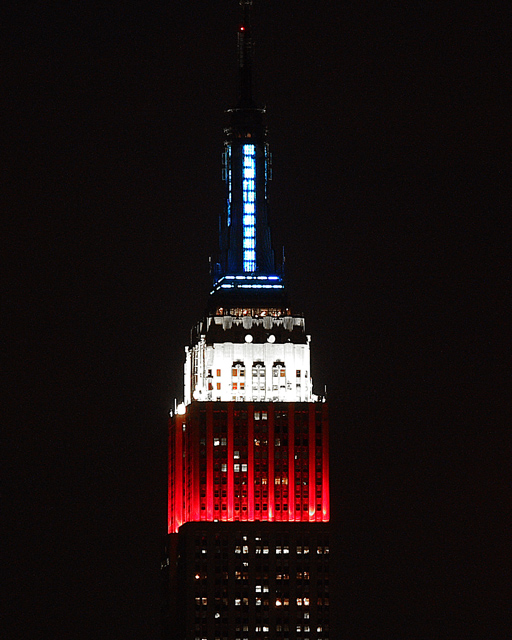
Cropped from original image. High contrast between light and dark red white and blue. Some enhanced un-sharpened mask and slight saturation touch up using de-saturate yellows and increased reds and blues.
Statistics
Place: 242 out of 343 Avg (all users): 5.1000 Avg (commenters): 7.0000 Avg (participants): 4.8881 Avg (non-participants): 5.4483 Views since voting: 1056 Views during voting: 330 Votes: 230 Comments: 6 Favorites: 0
Nice contrast in the photo. I thinkt he lights are light enough and the darks are dark enough to make this high contrast.
It's a bit odd that we can't see all of the building. One commenter mentioned that they like how you show more than just the color part, but in my own personal opinion, I think I wish I could see at least the outline of the building in the non red white and blue parts.
Focus from what I can tell is great. However, we can't really see much detail in the building at all, everything is so small. Which in reality isn't your fault, however, I keep squinting and getting real close to the screen to try to see more detail (which of course doesn't work).
The colors are neat. I wish the blue was as strong as the red and white, but not enough that it distracts from the photo in any way.
I do which there were some dramatic angle or have the building off center a bit. I think that would create some added interest and have more visual appeal that way.
SOme things work very well centered, and some things just need something extra. This is one of those shots that just need a little something extra to push it to pop.
~Heather~
Great capture. Good focus, contrast, and I think the centered composition works well. My only suggestion would be to include the actual top of the spire - I think the crop is too tight on the top - otherwise, great shot.
Red, white and blue are the national colours of over fifty countries from Cuba to Russia to France and US. Just thought I'd share that totally useless scrap of information.
Good contrasts whilst retaining detail. well done.





 Add photograph to your favorites
 Add photographer to your favorites


 Photographer found comment helpful.


