| Photograph Information |
Photographer's Comments |
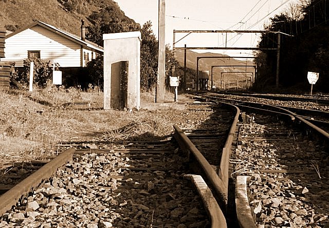
Challenge: Branch (Basic Editing III)
Camera: Panasonic DMC-FZ20
Location: Paekakariki Steam Museum, Wellington, NZ
Date: Sep 3, 2005
Aperture: f8.0
ISO: 100
Shutter: 1/80
Galleries: Landscape, Transportation
Date Uploaded: Sep 3, 2005
|
This has been a most frustrating exercise. I had the concept in my head but just couldn't get the desolation I wanted from this location or any other. Dodging commuter trains didn't make it any easier.
In the end, I went with this shot and set about seeing what I could do with it to give it a desolate or unreal feeling. Honestly, the original shot is just not good enough but by colourizing it with a sort of dirty unkempt colour, I am submitting it. About two hours ago with no time to try a re-shoot, I was going to withraw my entry in Branch on the basis of "near enough is not good enough"
Post-Production Adjustment Layers: Contrast +10, Colorized, Hue 30, Sat 27, Lightness 0
Reduced to 640 pixels, mirrored, slightly over sharpened to give it an unreal look. |
| Author | Thread |
|
|
09/14/2005 02:04:16 AM |
|
Well done brudder, moving up 20 odd places a challenge, you will get the blue soon :) |
|
 Photographer found comment helpful. Photographer found comment helpful. |
Comments Made During the Challenge  |
|
|
09/13/2005 11:45:25 AM |
|
| Photographer found comment helpful. |
|
|
09/12/2005 07:44:50 PM |
|
A bit more cluttered than I'd like, but I like the perspective. |
|
| Photographer found comment helpful. |
|
|
09/10/2005 11:24:59 PM |
|
| Photographer found comment helpful. |
|
|
09/09/2005 07:16:16 PM |
|
I think the sepia works well portraying the end of the branch and line, well done. |
|
| Photographer found comment helpful. |
|
|
09/09/2005 03:21:33 PM |
|
I like the ominous feeling... |
|
| Photographer found comment helpful. |
|
|
09/09/2005 10:19:15 AM |
|
my eye seems drawn to the continuing track, not the dead end. Hmmm...maybe it's the 'tunnel' of wire supports. I like the coloration, though. |
|
| Photographer found comment helpful. |
|
|
09/08/2005 09:45:42 PM |
|
Nice point of view. I like the sepia lending an old feel. The mid-ground feels harsh - is it due to the contrastiness? |
|
| Photographer found comment helpful. |
|
|
09/08/2005 02:49:39 PM |
|
I might have cropped off the right hand edge to get rid of the sign which is a bit distracting, good sepia treatment works well here |
|
| Photographer found comment helpful. |
|
|
09/08/2005 01:42:49 PM |
Yep, definitely the end of the line there!
Like the sepia tones. Gives an arid, dry and old feel to the shot. |
|
| Photographer found comment helpful. |
|
|
09/08/2005 11:46:03 AM |
|
I really like the sepia tone used. Original shot...Good work! |
|
| Photographer found comment helpful. |
|
|
09/07/2005 11:50:25 PM |
|
appropriate title. picture say a lot story. |
|
| Photographer found comment helpful. |
|
|
09/07/2005 11:44:16 PM |
|
Well done on the novel approach to the theme, but you should have cropped the buildings and sky since they just take away from your statement. |
|
| Photographer found comment helpful. |
|
|
09/07/2005 08:43:55 PM |
|
I like the angle and the lines leading the eye out of the upper right of your photo. Good color tone gives it an "old-time" feel |
|
| Photographer found comment helpful. |
|
|
09/07/2005 04:46:58 PM |
|
a wonderful shot. Did you try it with the house cropped out, might have even been better. |
|
| Photographer found comment helpful. |
|
|
09/07/2005 02:44:09 PM |
|
| Photographer found comment helpful. |
|
|
09/07/2005 12:18:23 AM |
|
Good concept. I also like the Sepia. It suits the shot well. |
|
| Photographer found comment helpful. |
Home -
Challenges -
Community -
League -
Photos -
Cameras -
Lenses -
Learn -
Help -
Terms of Use -
Privacy -
Top ^
DPChallenge, and website content and design, Copyright © 2001-2026 Challenging Technologies, LLC.
All digital photo copyrights belong to the photographers and may not be used without permission.
Current Server Time: 06/29/2026 09:09:38 AM EDT.