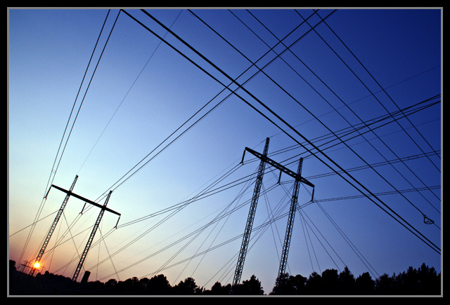
Great colors and perspective. I like the title too - it brings the image together for the viewer. As someone who just spent the last 3 hours removing utility lines from a photo of a church in town, I can certainly appreciate the pollution aspect. :-)
This is pretty cool. The forced "tilt" is a little precious, maybe, but I can't honsetly see offhand how to do it better. I'd clone out the tree bit on the left, but the loop doesn't bother me. From a processing perspective it's bright and pure. I don't mind the chaotic sense of the composition, I'm well aware that's what youw ant me to sense. Nice work!
hmm..colors are great for sure. Not confused by all the lines, mesmerized is more like it. I can picture myself sitting in an almost identical location with the same view and I am captivated. So much to follow and think about. Each tendril leading to another place I don't want to go but have to face. Nice image. I like it. Well done!
Confusing is probably the first word that comes to my mind. The colors are all very nice, but not powerful enough to carry the image. I think the combination of too many electrical lines with the tilted horizon make it just a little too confusing.
I'm a big fan of lines, period, just take a look at my portfolio, I have a folder dedicated to them. I see lines all day, can't get enough of them. The tilt you gave the shot makes it interesting, whereas a level shot may have been run of the mill. Placing the sun behind the girders was also a good idea, I think it helps with the general alignment of the shot. How could this shot be improved? Definitely clone out that naughty bit of loop in the wire along the right side. Maybe include a bit more of the trees at the left to help frame the corner, around the sun. Cool shot, lines rule.
Confusing is probably the first word that comes to my mind. The colors are all very nice, but not powerful enough to carry the image. I think the combination of too many electrical lines with the tilted horizon make it just a little too confusing.
Confusing is probably the first word that comes to my mind. The colors are all very nice, but not powerful enough to carry the image. I think the combination of too many electrical lines with the tilted horizon make it just a little too confusing.




 Add photograph to your favorites
 Add photographer to your favorites

 Photographer found comment helpful.


