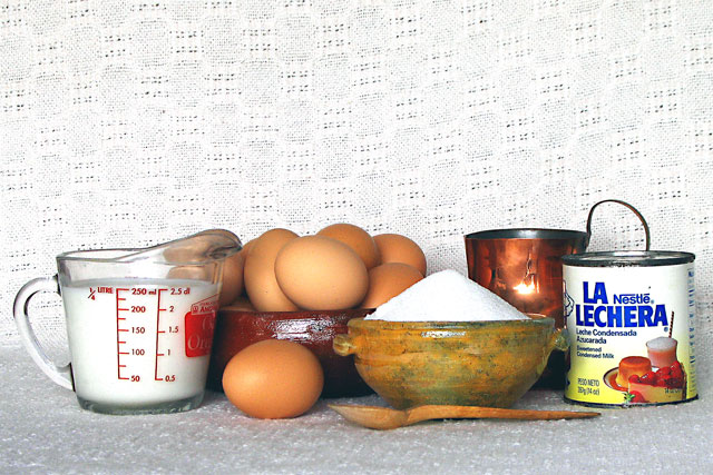
I think this picture would profit from a higher angle: it would add some perspective. With the low angle you chose, the ingredients are too close together for my taste - much of the vertical space remains unused.
Also, a softer light source and a dark background would have been great here. 8.
Excellent lighting and exposure. In some ways I like the backdrop because I think it adss a "homey" feel to it, but in other ways, the texture is a bit obtrusive. It doesn't bother me in the bottom half (where they sit). Perhaps if hte ingrediants were pulled closer to the camera, and away from the background so that the depth of field obscured it, it would be better. Also, the composition seems a bit flat to me. Maybe if you played with the arrangement so that the ingrediants were at different heights, etc, and led more "front to back" rather than "side to side."
Yum. Flan... I would have picked a different backdrop. The embroidary is distracting to the picture, where I feel the focus should be the ingredients, not the background.
Great idea. Good use of tablecloth and the earthenware works well. Perhaps the milk could have been in a clear bottle rather than a pyrex measuring cup.






 Add photograph to your favorites
 Add photographer to your favorites


 Photographer found comment helpful.


