| Author | Thread |
Comments Made During the Challenge  |
|
|
08/28/2005 11:56:33 PM |
|
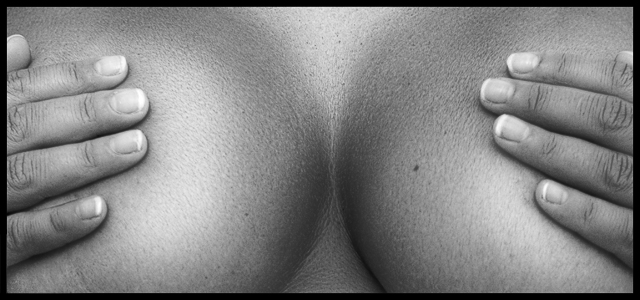
You make her skin seem both glossy smooth and textured at the same time, very well done. |
|
|
|
08/28/2005 07:05:06 PM |
|
Nice shot. Great concept and composition. A bit soft on the right. |
|
|
|
08/28/2005 03:56:05 PM |
|
I really like it how the highlights/shadows emphasise the shapes. Great symmetry as well. |
|
|
|
08/28/2005 01:56:07 PM |
|
Good composition with the delicate charm of b/w. Bumping up. |
|
|
|
08/27/2005 07:12:37 PM |
|
Nice tits ;-) Gotta love the lines in this one! 7 |
|
|
|
08/27/2005 04:22:30 PM |
|
great composition and you've got the skin tones perfectly. well done |
|
|
|
08/27/2005 02:06:59 PM |
|
This doesn't look like less at all :-P |
|
|
|
08/27/2005 01:00:45 AM |
It sure is! Cool, cheeky, funny, original. May not be very erotic, but I like the lighting, hands on breasts, B&W (i.e. refreshingly non selective desat...), the format/aspect ratio of the shot, near symmetry of it.
I give you a 9.
Bruno |
|
|
|
08/26/2005 01:03:05 PM |
|
very nice but if the fingers were in focus you could score much higher. and true, less IS more. |
|
|
|
08/25/2005 09:25:18 PM |
|
I like the whole less is more thing. I think this might not get the votes that it deserves, I think the finger tips should have maybe been more in focus. I hope you do well. Good luck. 9 |
|
|
|
08/25/2005 09:08:17 PM |
|
Nice placement. Not sure about the focus, though. I think it would have been nice to have the hands in focus as well. |
|
|
|
08/25/2005 02:51:44 PM |
|
I really wish your focus was sharper here. Nice idea; the title adds to the image. |
|
|
|
08/25/2005 06:21:22 AM |
|
great symmetry...a little on the soft side though (focus..that is)..7 |
|
|
|
08/24/2005 09:20:04 PM |
|
dont really have any advice for this shot. maybe less fingers? 2 or 3 instead? |
|
|
|
08/24/2005 07:46:08 PM |
|
Love the simplicity & detail of textures in this. The B&W really works. |
|
|
|
08/24/2005 07:00:10 PM |
|
Nicely done. Excellent focus and dof. The texture and tones of the skin is fantastic. Nice crop and good use of border. Well done. |
|
|
|
08/24/2005 01:03:52 PM |
|
Love the detail in this shot. The capture is amazing! Lighting is great! |
|
|
|
08/24/2005 11:17:44 AM |
|
lighting a bit harsh for subject matter |
|
|
|
08/24/2005 02:43:07 AM |
|
Good contrast and composition. Excellent photo. |
|
|
|
08/24/2005 12:58:52 AM |
|
Great B/W tones. Nice composition. Yes, sometimes less is more. :-) |
|
|
|
08/23/2005 11:14:28 PM |
|
I like everything but the title. lol |
|
|
|
08/23/2005 08:22:12 PM |
|
I like the clarity of the photo and the tonal qualities. Nicely artistically done. |
|
|
|
08/23/2005 03:15:27 PM |
|
I really like the lighting on this one. |
|
|
|
08/23/2005 01:42:24 PM |
|
Lovely, smooth and depth. |
|
|
|
08/23/2005 01:34:38 PM |
|
You are right about that. But maybe if less hands where more? Great focus, good work. |
|
|
|
08/23/2005 11:27:51 AM |
.
Message edited by author 2005-09-29 16:53:20. |
|
|
|
08/23/2005 11:16:50 AM |
|
|
|
08/23/2005 09:18:59 AM |
|
great image, love the lighting and symetry - the only thing I would change is the title :) |
|
|
|
08/23/2005 08:29:29 AM |
I like the simplicirty of this.
Nice form lightinhg & contrast.
My only criticism is that the hands liik very masculin. Or are they? This should be made clear to the viewer. |
|
|
|
08/23/2005 06:55:02 AM |
|
for sure! awesome sharpness, focus and tones. |
|
|
|
08/22/2005 11:45:01 PM |
|
Excellent, i love this. 9 |
|
|
|
08/22/2005 11:05:32 PM |
|
I contemplated this pose, and you (or your model) probably out did me. I love the tonel. I might have given this more than I did, had the border been a bit less. (However it's well inside accceptable, just think it's unneccesary) |
|
|
|
08/22/2005 11:02:56 PM |
|
I would have cropped this from finger tip to finger tip. I think it would have fit your title better and the distracting hands would be out of there. |
|
|
|
08/22/2005 10:48:01 PM |
In this instance less is more. I love the tight crop. I also am glad that you didn't neat image all the character out of her skin. Great job.
TC |
|
|
|
08/22/2005 10:15:00 PM |
|
Nice symmetry.... I like the way the skin looks almost metallic. |
|
|
|
08/22/2005 09:55:04 PM |
|
I like the message of this shot. Good texture on the skin and hands. Good crop to make the symmetry. |
|
|
|
08/22/2005 09:22:00 PM |
|
I love the contrast, the fingers show age, while the breasts seem to show youthfulness. Good lighting. Overall, a good image. 7 |
|
|
|
08/22/2005 07:04:04 PM |
|
not frame , please !, i doen not see less, just enought ! |
|
|
|
08/22/2005 04:37:24 PM |
|
If I was a member, this shot would be a 10 and in my opinion it should win first place. Excellent skin tones, shadows, and the symmetry on it is excellent. |
|
|
|
08/22/2005 04:29:31 PM |
|
Very interesting crop. Causes the pic to become a study in lines and texture rather than a standard nudie-pic. Original. I like it. |
|
|
|
08/22/2005 04:29:10 PM |
|
I like the texture of the skin in this one. The frame is a bit to thick, but other than that a great job. |
|
|
|
08/22/2005 02:51:06 PM |
|
how very janet jackson. Good crop - less IS more. |
|
|
|
08/22/2005 02:42:47 PM |
|
Good, clean, and very artistic. The reflection does distract a little, but is not overwhelming. |
|
|
|
08/22/2005 02:41:58 PM |
|
Beautifully simple image. Tones work well as does lighting. Love the symmetry. 8 - Good luck in the challenge! |
|
|
|
08/22/2005 02:00:11 PM |
|
Lovely curves in the breast showing form, but for this type of close up where you have the hands as parts of the composition, they need to be 100% exact mirrors of each other. |
|
|
|
08/22/2005 01:01:23 PM |
|
I love the detail, and the wonderful tonal range from black to white. Very nicely done. <7> |
|
|
|
08/22/2005 12:46:57 PM |
|
I get the idea, but I'm not crazy about the long rectangular crop. Maybe some post editing might've given it a bit more oomph. |
|
|
|
08/22/2005 09:58:34 AM |
|
This photo is a definite plus to this challenge. |
|
|
|
08/22/2005 01:45:49 AM |
|
...more or less. Either those are very large breasts or very small hands. :) |
|
|
|
08/22/2005 12:56:04 AM |
|
nit picky but the finger tips seems a bit out of focus... also i think your shot could have used a bit more darks to increase the tonal range. A creative shot. |
|
Home -
Challenges -
Community -
League -
Photos -
Cameras -
Lenses -
Learn -
Help -
Terms of Use -
Privacy -
Top ^
DPChallenge, and website content and design, Copyright © 2001-2026 Challenging Technologies, LLC.
All digital photo copyrights belong to the photographers and may not be used without permission.
Current Server Time: 06/28/2026 06:19:17 PM EDT.