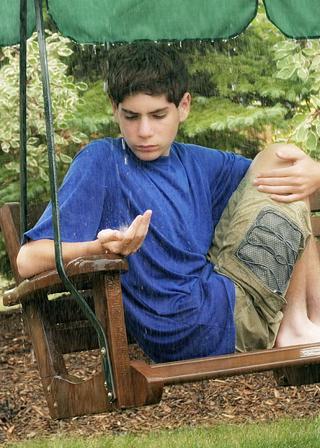
Catching water in his hand makes this photo for me, a really good idea. The composition somehow doesn't suit the subject, I think this could be improved if you work to make his hand the primary subject, and flow can go up the dropping water to his face.
Nice portrait. I naturally key in on the eyes in a shot like this. In this case they appear closed and in shadow which dosen't really seem to fit to me. I guess the brightness and vivid colors clash with the somber mood of the subject. This could make an interesting contrast, but i'm just not getting it here. Perhaps further creative editing could bring the mood of the shot closer to that of the subject.
Not a bad shot at all. I like the composition & angle. The image does look a bit grainy though and I think the colors could use a bump. Still, pretty good entry.
'7' (only pretend and fyi) - I like this shot but, criticism; would really like to have seen how this would have looked in b/w or, just some type of desaturation, trying to keep the 'water' well contrasted. The seat/swing has character and I would like to have seen you 'use' that more, in my opinion that, and possibly more 'water capture' would have made this a better and more dramatic shot in my opinion.






 Add photograph to your favorites
 Add photographer to your favorites


 Photographer found comment helpful.


