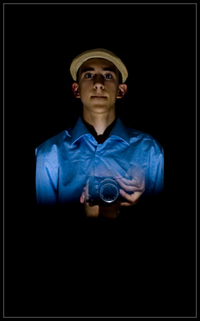
The first thing that stikes me is too juch dead space, particularly along the bottom third of the image.
The second thing is the 'double-exposure effect' - just looks off balanced. The I realized why....the hand is more visible than the upside down head, so at first you notice the hand which would not be in the ocrrect anatomiacal presentation to be shooting a camer. After really searching the image, you notice the head under the camera..
The wrinkles in the shirt are a bit distracting also.
Colors are nice - bright blue on black. And the color of the cap is perfect as it does not over-power the face, but accentuates it. I like the lighting and shadows.
Over all, while this was nto a favorite shot of mine, it was very creative and executed fairly well.
Nice job of holding the pose for such a long exposure. Interesting cropping, but I find something here a little lacking. Can't put my finger on it, but I don't find my attention drawn to this very much...
TC
Very good concept. Nice execution. At first I did not like the bottom 1/3 of dead space, but now, no, I still don't., sorry. The hands decreasing on opacity towards the bottom and continuing after the body ends is a bit strange. Maybe the camera alone? 8




 Add photograph to your favorites
 Add photographer to your favorites


 Photographer found comment helpful.


