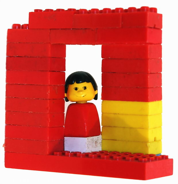
I actually like this pic. I wish the left edge was a little straighter, but I think the setup is pretty good. It's true, it's a bit soft and has weird lighting, but I think it has a nice feel to it and the choice of lego character is excellent in the face.
OK, now I REALLY don't get it!!! When I first saw this image, I thought it was someone new to photography and was making a (rather poor) attempt at an optical illusion. Honestly I felt it was out of focus, the shadow was distracting, the composition rather poor and the subject just plain unappealing. I looked at your portfolio and the circles image jumped out at me. I remember it as being my favorite and I picked it to ribbon in the challenge. The rest of your portfolio is full of beautiful images. You truly have genuine talent and a keen eye. What the heck is up with this entry. Please enlighten me.
This is the hardest kind of shot for me to comment on. There is so much here that doesn't work. You have too much harsh light. You have an un attractive dirty subject. Your focus is a tad bit off. Your color scheme doesn't makes sense. Please don't take this comment the wrong way. I truly wanna help, but just don't know where to start with this image...
TC
First Impression: Not sure on this one. Very good and everything, but something hurts it, not sure if is the red, or the center face composition, the very white background. Not sure..
Was I fooled? If the Lego was not worn, it would have been more effective. But nice illusion :)
I think the focus could be a bit more crisp here, and if the subjects were a little less dirty... there isn't much appeal here, and I'm hard put to see the impossible... perhaps I'm just jaded though, having seen just about every trick legos (and duplos) can accomplish from working in daycare. I also think the colors take a bit away, though I know that's just a personal thing... Perhaps in black and white?
Your illusion is nicely built. Good job on that. However, the worn out legos are not visually appealing. A basic box of Legos is not all that expensive. Perhaps using only one color would have been better too.







 Add photograph to your favorites
 Add photographer to your favorites

 Photographer found comment helpful.


