| Author | Thread |
|
|
05/27/2003 12:35:54 AM |
An interesting take on the challenge.
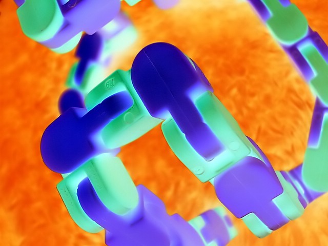
The colors really pop up from the screen as you discover the image, and I like that. ... It was important to focus on that, because the theme is "colors". You managed through your original processing to get vivid and clean colors. This image, with the processing you did, has a surreal look I really like. The fact that I can't really tell what it is makes me focus on the colors, which is the main subject here. Very well done.
However, the way you modified this image makes this entry more a digital work than a photograph. I find it difficult to judge this entry because of that. It is not a photograph anymore in my opinion. I still think it was a good move in the particular case of this theme, because the unreal look focuses on colors, but at the same time I can't stop thinking you're out of the limits of the contest. The best proof is that I can't judge of the quality of exposure here: it is totally irrelevant.
So I have very mixed feelings. I think it is a very good digital work, but not a photograph.
Good luck for your future entries!
The Critique Club |
|
 Photographer found comment helpful. Photographer found comment helpful. |
Comments Made During the Challenge  |
|
|
05/18/2003 01:30:16 AM |
|
Oh, if those pieces were purple, and not blue... Did you try some hue shift of the blues in photoshop? Could do the trick! |
|
| Photographer found comment helpful. |
|
|
05/16/2003 05:16:43 PM |
|
It's not often I like such an obviously processed shot in the challenges but this one does it for me. Love the colours and the texture on the orange background - almost looks like flames. Great stuff, well done. |
|
| Photographer found comment helpful. |
|
|
05/16/2003 05:16:40 PM |
|
I like but have nowhere for my eye to focus on, very imaginative |
|
| Photographer found comment helpful. |
|
|
05/16/2003 04:56:19 PM |
|
great photo... i hope other people understand that the photo is inverted.... i wold like to see the original |
|
| Photographer found comment helpful. |
|
|
05/16/2003 10:12:35 AM |
|
i think this is one of the rare instances where i don't mind people pushing the limits of photoshop type programs. this photo has a nice smooth feel to it and the 3d effect you have created is nice as well. as a photo, as digital art, you did a good job i think, as a photo, i think you're really reaching. 5 |
|
| Photographer found comment helpful. |
|
|
05/15/2003 06:27:00 AM |
I have no idea about the title (unless you're Busta Rhymes, in which case that's the only phrase in your vocabulary), but it's a nice pic, full of vivid secondary colour. I can't work out what it is though...
Just had a thought - is it 'flip mode' as in a negatively coloured pic? In which case, clever. |
|
| Photographer found comment helpful. |
|
|
05/14/2003 02:55:32 PM |
|
Wow! Great abstract with in-your-face colours. I could see a modern art collector buying this. I think I'd crop a bit tighter on the left to balance things up a bit. Good one. |
|
| Photographer found comment helpful. |
|
|
05/14/2003 02:36:18 PM |
|
Good job. I like the way you chose to use these colors to display secondary colors. |
|
| Photographer found comment helpful. |
|
|
05/14/2003 02:22:53 PM |
|
i like this image, the effect is great; how'd you do it? |
|
| Photographer found comment helpful. |
|
|
05/14/2003 02:01:30 PM |
|
| Photographer found comment helpful. |
|
|
05/14/2003 11:40:22 AM |
|
not sure what it is but I still like it |
|
| Photographer found comment helpful. |
Home -
Challenges -
Community -
League -
Photos -
Cameras -
Lenses -
Learn -
Help -
Terms of Use -
Privacy -
Top ^
DPChallenge, and website content and design, Copyright © 2001-2026 Challenging Technologies, LLC.
All digital photo copyrights belong to the photographers and may not be used without permission.
Current Server Time: 06/30/2026 01:27:07 AM EDT.