*Critique Club*
I would have to agree that your greens don't really look green. Also, despite what was mentioned, Pink is not a secondary color. It's technically considered a "tint". A secondary color consists of a mixture of equal amounts of 2 primary colors. A tint (pink for example) is created by mixing white or black to a color. White and Red are mixed to get pink.
Anyway, I do see what looks to be a small section of orange in the middle of the pink, so that counts. :)
I don't think though, that the orange is enough to screem "This is a photo of secondary colors". And the green isn't really showing through.
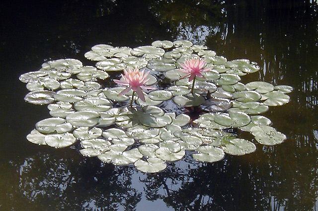
I agree with the comment that this is a bit too centered. I wonder how this would look if the flowers were down in the bottom left corner, and there were some of the lake in the upper right. This could create a dramatic angle, and make it a bit more visually appealing.
Focus and clarity look to be good, but I think that the lighting makes it a bit difficult to tell exactly. The detail in the shot is definately muted some by the bright lighting.
I do think it's a pretty shot. It's a really nice scene. Nice flowers, nice reflection, but maybe just not right for the challenge.
~Heather~
Like the composition however I feel it could use a bit more color and contrast for the lillies as I feel drawn too much to the reflections on the water.
the exposure here and the lighting seem to diminish the secondary colors of green and pink... the light is possibly a bit too strong to make the colors stand out very well.. = 5
I like how the lily pads are little mirrors for light, but I'd like to see their colors more, regardless. Still, I think you succeeded in what you were trying to do. This is an interesting and unique shot!
This is an interesting effect. I really like the use of shape. I would like to see how it looks with lower exposure - I would expect the water to go dark and frame the lilly pads which would be a deeper green and the flowers would have definition.
This is a pretty good picture but the green’s seem a bit washed out. I like the reflection of the trees in the water but would have liked this shot better if the group of lily pads was not quite so centered. Exposure and focus look good but this just isn’t quite enough to hold my attention. I gave it a 4.
At first I thought this would be boring shot but I like it. I like the way you have clear water around the leaves and reflections on the water. THe light reflecting off the leaves gives a very tranquil feeling.
My 'brain' knows these waterlilies are beautiful but my eyes can't quite feel it because they are too far away. The reflection of the trees in the water is very appealing and i like how the dark tree shadows frames this delicate bed of waterlilies and leaves. I'm not at all a stickler about meeting the challenge, but one might argue that these green leaves really look grey here and the lilies aren't orange but pink :) 7
Hi, I think you were really on the right track here..... but if you had either, moved around the other side of the water or come back when you weren't shooting into the sun this would have been a much, much better shot. Good luck, Todd.
Nice, but a little too bright. I think your camera's compensated for the dark areas around the edge. If your camera has a centre-weighted metering mode, that would have worked better for this shot.
I'm wondering if a reduced reflection from the leaves would have brought out better hues at dawn or dusk, assuming the shot was had during the day? The image would have warranted revisiting.
Any reason for spelling 'lilly' with a double 'l'?







 Add photograph to your favorites
 Add photographer to your favorites


 Photographer found comment helpful.


