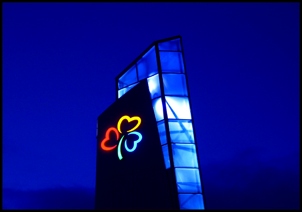
This is the top of an Icelandic mall. The light inside the glass goes gradually from white to blue, to yellow, to purple, to orange and back to white. First I wanted to capture the purple color for the secondary colors challenge, but ended up with it in the primary one. No major changes were done to the colors.
Statistics
Place: 24 out of 99 Avg (all users): 6.0952 Avg (commenters): 8.0000 Avg (participants): 6.1622 Avg (non-participants): 6.0000 Views since voting: 1436 Votes: 126 Comments: 16 Favorites: 1 (view)
Composition: I think the landscape format is ok, but I agree that putting the subject off-center would be a good idea. Somehow it doesn't look right the way it's now. The structure is "leaning" a bit to the left, out of the center of the image. Putting it on the right side it would "lean" toward the center.
Another change I personally would like to see is a bit _more_ negative space of the sky, i.e. a more wide view (zoom out).
Lighting: Great! This is the best part of the photo. I love the blue. The mix of natural lighting at evening and the glow of the glass thing is great. You wrote you wanted to capture the light when it was purple. I think it was a good decision to.It fits to the blue of the evening sky and this makes it more pleasant to look at because it doesn't distract from the clover neon sign.
Focus: As far as I can see the focus is good.
Challenge: Yes, the challenge was met.
Creativity: A good eye recognising alll three primary colours but the lighting you used makes this photo special.
i don't mind the subject too centered, love the blue background ,it helps hold the subject in place........ primary colors in the center ties everything together coz it holds the viewers attention right where u intended them to look......
excellent primary color shot... I think it would have been even stronger as a vertical shot which would have allowed you to not be 'dead centered' and fill more of the frame...






 Add photograph to your favorites
 Add photographer to your favorites

 Photographer found comment helpful.


