| Author | Thread |
|
|
08/03/2005 12:16:51 AM |
|
Nice study. Congratulations on your top twenty finish. |
|
 Photographer found comment helpful. Photographer found comment helpful. |
Comments Made During the Challenge  |
|
|
08/02/2005 12:31:32 PM |
|
Great shot! The colors are doing well in the image!!! |
|
| Photographer found comment helpful. |
|
|
08/02/2005 09:34:44 AM |
|
| Photographer found comment helpful. |
|
|
08/01/2005 09:29:19 PM |
|
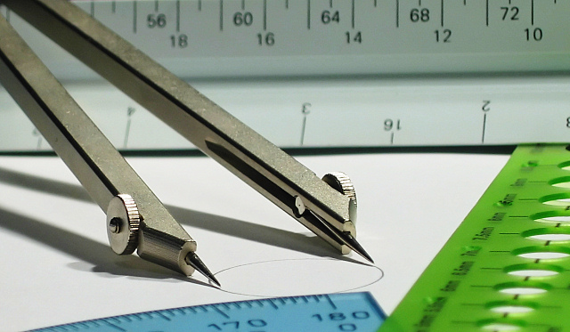
Good job - I like the use of minimal color, just enough to give it some pop. The instrument (?) is nice and sharp |
|
| Photographer found comment helpful. |
|
|
07/30/2005 08:12:58 PM |
|
good texture on the metal. Good use of frame-within-a-frame. --10 |
|
| Photographer found comment helpful. |
|
|
07/30/2005 11:08:36 AM |
Relevance to theme – 3/3
Composition – 3/3
Technical (Lighting ect…) – 1/2
Creativity – 1/2
|
|
| Photographer found comment helpful. |
|
|
07/29/2005 06:52:18 AM |
|
Nice composition and use of DOF. |
|
| Photographer found comment helpful. |
|
|
07/28/2005 12:23:17 PM |
|
| Photographer found comment helpful. |
|
|
07/27/2005 10:59:19 PM |
|
8 - Met the Challenge. I like this shot it is very clean and captures the 'feel' of the compass well. The colors are simple and there is no clashing and given the subject I do not think anything bolder is required as it would make the silver 'metal' of the compass 'fade'. Criticism; I would like to see even more sharpness on the compass, more emphasis somehow on it. Maybe a tighter crop taking out more of the top, but I realise you would then lose the rule there. Maybe turning that upside down to have the numbers and lines, as that would still fit in with the style/angles of the others. Perhaps more play on the shadow, not sure. |
|
| Photographer found comment helpful. |
|
|
07/27/2005 10:31:47 PM |
|
Good subject matter, good lighting nice shadow, however I would have preferred just one item in front of circle- perhaps on a 45 way over in the corner. Blue and green are conflicting and causing too much eye distraction. "8" |
|
| Photographer found comment helpful. |
|
|
07/27/2005 08:35:08 PM |
|
I think this would also work well in B&W. |
|
| Photographer found comment helpful. |
|
|
07/27/2005 03:37:20 PM |
|
Love the lighting on this! Very effective. |
|
| Photographer found comment helpful. |
|
|
07/27/2005 02:00:35 PM |
|
This might have looked good as a B&W... Well done! |
|
| Photographer found comment helpful. |
|
|
07/27/2005 01:06:11 PM |
|
Great focus, superb compostion 10 |
|
| Photographer found comment helpful. |
|
|
07/27/2005 12:39:36 PM |
|
| Photographer found comment helpful. |
|
|
07/27/2005 08:52:08 AM |
|
| Photographer found comment helpful. |
Home -
Challenges -
Community -
League -
Photos -
Cameras -
Lenses -
Learn -
Help -
Terms of Use -
Privacy -
Top ^
DPChallenge, and website content and design, Copyright © 2001-2026 Challenging Technologies, LLC.
All digital photo copyrights belong to the photographers and may not be used without permission.
Current Server Time: 06/27/2026 06:58:04 PM EDT.