| Author | Thread |
|
|
08/03/2005 12:17:37 AM |
|
Great composition. Congratulations on your top twenty finish. |
|
Comments Made During the Challenge  |
|
|
08/02/2005 11:46:36 PM |
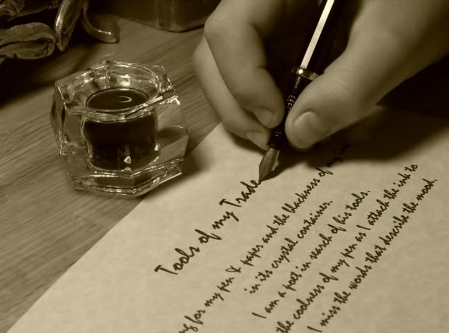
Looks really nice in sepia. Good Luck!
|
|
|
|
07/31/2005 10:07:13 PM |
|
Classic shot. I really like the tone and lighting. |
|
|
|
07/30/2005 08:35:31 PM |
|
Good interpretation of the theme. Good framing. Needs more texture on the hand. and pen. |
|
|
|
07/29/2005 04:59:13 PM |
|
Very nice composition. Well put together and such a good idea. I love the poem from what I can read of it. Very creative and I like that. Good job. 10 |
|
 Photographer found comment helpful. Photographer found comment helpful. |
|
|
07/28/2005 07:55:01 PM |
|
Kudos if you actually can write that neat. Very nice picture also. |
|
|
|
07/28/2005 10:17:59 AM |
|
great focal point~! i love the composition of the photo~! great job and good luck~! |
|
|
|
07/27/2005 11:30:51 PM |
|
Love the idea, and the composition. My one criticism is the choice of font - it's very easily recognized, and makes it obvious that the page was printed and not actually written by hand. There are tons of free handwriting fonts available for download that wouldn't be so easily recognized. I love the creativity, though! |
|
| Photographer found comment helpful. |
|
|
07/27/2005 11:18:56 PM |
|
7 - Met the Challenge. The jury is still out on the 'viability' of this 'trade' however for now it is a 'pass'. Good attention to detail save for one thing (and I may be mistaken) but the last word written would be 'mood' and thus the pen there. Criticism; given that, and for other reasons, in my opinion this would be a better photograph if the angle were a lot sharper, from the page 'up'. A crisper focus on the pen/calligraphy would be better for me. |
|
| Photographer found comment helpful. |
|
|
07/27/2005 07:06:26 PM |
|
|
|
07/27/2005 03:35:39 PM |
|
| Photographer found comment helpful. |
|
|
07/27/2005 02:47:54 PM |
|
|
|
07/27/2005 02:18:42 PM |
|
i like the sephia tone... gives it a very classy look. |
|
|
|
07/27/2005 12:22:04 PM |
|
nice composition. It's cute that it says "tools of my trade", but it would be a better overall pic if it was something else more generic. Still, one of the better pics I've seen in early votiing. |
|
| Photographer found comment helpful. |
|
|
07/27/2005 10:48:20 AM |
|
|
|
07/27/2005 01:32:08 AM |
|
this shot would be more effective if the calligraphy was actually handwritten. |
|
|
|
07/27/2005 12:51:45 AM |
EDIT: "unhelpful" comment removed by voter
Message edited by author 2005-10-05 01:38:53. |
|
Home -
Challenges -
Community -
League -
Photos -
Cameras -
Lenses -
Learn -
Help -
Terms of Use -
Privacy -
Top ^
DPChallenge, and website content and design, Copyright © 2001-2026 Challenging Technologies, LLC.
All digital photo copyrights belong to the photographers and may not be used without permission.
Current Server Time: 06/27/2026 05:29:59 PM EDT.