| Author | Thread |
|
|
05/20/2003 12:53:48 PM |
Greetings from the Critique Club :)
Hi Geocide...
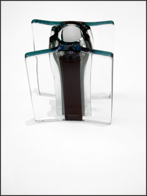
I think this is the beginning of a pretty strong abstract... I think your compositional choices on this photo are pretty good, but there may be a bit of room for suggestion here... I don't know how many different compositions you tried, but I'm thinking that a little rotation on the 'object' could create some more strength in the image. I think a slight rotation would create some diagonal strength in the lines of the image...
I like the starkness of the exposure here also. The high key creates a lot of good contrast and sets an interesting overall mood for the shot.
Excellent work...
John Setzler
|
|
 Photographer found comment helpful. Photographer found comment helpful. |
Comments Made During the Challenge  |
|
|
05/13/2003 01:08:44 PM |
|
I think lowering the subject in the frame would have added much more interest to the overall shot. |
|
| Photographer found comment helpful. |
|
|
05/12/2003 08:14:07 PM |
|
a different color in the background i think would have brought a lot more intrest to your picture. Nice Work though. |
|
| Photographer found comment helpful. |
|
|
05/10/2003 04:33:15 PM |
You're right. It looks simple, but what is it :) Interesting. Jacko. 7
|
|
| Photographer found comment helpful. |
|
|
05/09/2003 06:55:03 PM |
|
I think this represents good technical photography skills, however the photo isn't very interesting. |
|
| Photographer found comment helpful. |
|
|
05/08/2003 03:35:27 AM |
|
... and effective. The object looks quite solid, but I think the white space below makes it seem to float in space. |
|
| Photographer found comment helpful. |
|
|
05/07/2003 11:02:25 AM |
|
too bad about the shadows...I really like the image. better lighting would lessen the need to brighten this and delineate your subject better. good job. |
|
| Photographer found comment helpful. |
Home -
Challenges -
Community -
League -
Photos -
Cameras -
Lenses -
Learn -
Help -
Terms of Use -
Privacy -
Top ^
DPChallenge, and website content and design, Copyright © 2001-2026 Challenging Technologies, LLC.
All digital photo copyrights belong to the photographers and may not be used without permission.
Current Server Time: 07/01/2026 07:51:53 PM EDT.