|
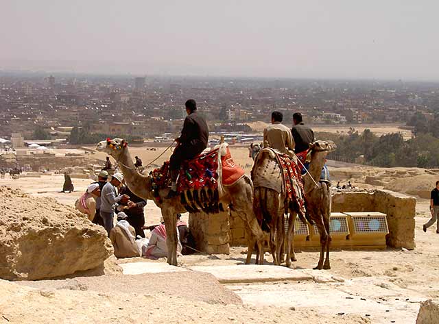
What an interesting juxtaposition of old and new! I like the color rendering and the "feel" of this image. I would suggest cropping the right side a bit more, for two reasons...cutting out the partially-pictured man, and making for a less-centered subject. I'd also rotate a tiny bit to the left, as the horizon seems a little bit tilted. It probably isn't, but the angle makes is appear so. Nice post! :) |




 Add photograph to your favorites
 Add photographer to your favorites


 Photographer found comment helpful.


