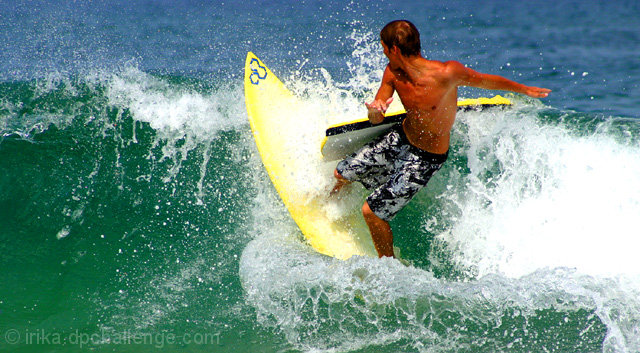
8 - Not a bad surf shot, without the title I wouldn't have 'grasped' the secondary 'action' here. Adds another element altogether. Good opportunity. Criticism; more focus of course, maybe tighter crop, somehow enhancing the contrasting blue/green of the ocean, but with the color of the surfer that would be hard. This shot is about the 'double action' though, as I perceive it, so you have probably done the best you could with what you have.
his body looks a little oversaturated, IMO. i love the green hued water vs. blue, neat contrast. i think i would have preferred it without the boogie board in there. too bad the wave is so blown out on the right. all said, nice image.





 Add photograph to your favorites
 Add photographer to your favorites


