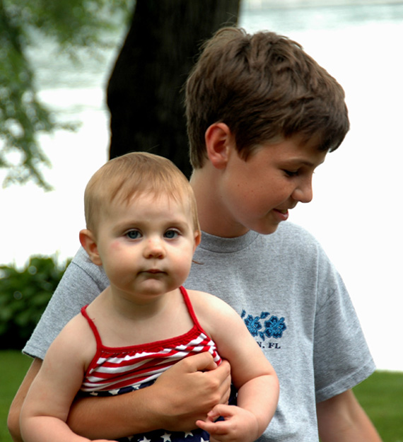
The composition isn't the greatest. The two kids should have their interest directed to the same object. The younger kids face os blown out and focus is very soft on his face.
The young one has an interesting facial expression here I think a tighter crop would have highlighted that. I don't think the background is adding much so in this case I think less would have been more.
Hi there, sorry couldn't resist. Lighting is a little dark on face of older child. I'd remove the hot spot from the little ones nose. Cute picture though.
This is a sweet image ... but... its overexposed causing hotspots on the baby's skin, also composition is arranged in such a way that they have a tree "growing out of their heads". A step to the left or right would have avoided that.





 Add photograph to your favorites
 Add photographer to your favorites


 Photographer found comment helpful.


