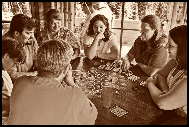
Lots of post-processing to get the tones I wanted:
- Desaturate with hue/sat layer
- Adjust tonality with hue/sat in color layer
- Adjust brightness and contrast
- Add sepia toning with Color Balance layer
- Dodge & Burn layer to get highlights right
- Noise layer to add old time feel
- Diffuse Glow
- Crop and Sharpen
Statistics
Place: 34 out of 159 Avg (all users): 5.7878 Avg (commenters): 6.8696 Avg (participants): 5.5882 Avg (non-participants): 5.8938 Views since voting: 986 Views during voting: 389 Votes: 245 Comments: 25 Favorites: 1 (view)
I like this photo it shows to me how a family should interact together instead of just sitting back and watching tv. This is what my family dont do as ofen as we would like.
Good choice to make this Sepia coloured, gives that "timeless" feel too it, it seems they could just as easily have been wearing cowboy hats and been playing poker and this shot had been taken about 140 years ago.
Something about the way that this was processed makes it look artificial; too much sharpening perhaps? The background is distracting, and the foreground seems to be dedicated to a well focused view of someone's back. My favorite part of the image is the figure in the left edge of the frame who's looking down at the table. A shot taken of this person from a lower angle and looking up slightly at them would have been much a stronger submission. As it stands there's not a clear point of interest.
The sad thing is, not a lot of voters will know what that game is...
The two people on the swing outside would be really bothersone if not for the one looking this way!
awesome...this is so very seventies
love the detail
is this somewhere in East Europe i wonder
the peek tru the window is a fantastic add
the composition is superb and it totally speaks family
great job!
this is my svorite photo in the challenge...it is the one that truly represents the concept of family ....each person in the photo tells a different story and the fact that it is candid adds to it even more...very well done....you got my 10
While a great capture I don't think the sepia tones add to this image. I would have liked to see it in B&W or even a slightly darker tone than it currently is. This tone kinda sucks the life out of it for me. Great focus good balance and composition. Good luck in teh challenge! 6
I like the glowy-sharpened effect, nice.
I don't really like the border though, the white is way too thick for me... It distracts from the image, but not my vote. :o)
Would be great to know this game, great picture and good work on it. The face sneaking in at the top is amusing, would have liked it to be a bit off center but it is difficult to nitice everything when thaking a photo.
I like the composition of the shot. The focus and DoF are excellent. What bothers me is the post processing. Especially evident in the womans face second from right - a little harsh. Also works better not being in color. Sets a mood for the shot.





 Add photograph to your favorites
 Add photographer to your favorites

 Photographer found comment helpful.


