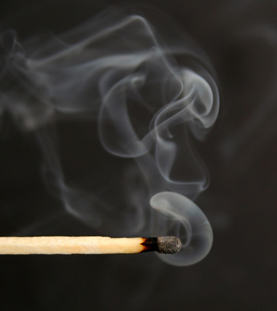
I think that this is great!! I wish that there was more focus on the texture of the match though. The wooden match is overexposed. I would have cropped the bottom off under the match. I think that with different cropping and lighting, this entry would have done much better. I hope this was helpful. I am really tired. Good luck in future challenges and God Bless.
maybe a tighter crop so the image is not so square? A narrower format would imply smoke going up. and the really interesting smoke is in middle vertically.
The straight angle of the match does´nt go well in portrait format. You should have used landscape. (But that´s only my opinion ofcourse :) Like it though...I´ll just turn my screen 90 degrees.
I like this. I am glad you kept it in color - I've seen others that went to grayscale and this touch of warm in the wooden match stick is interesting. Very crisp detail.







 Add photograph to your favorites
 Add photographer to your favorites

 Photographer found comment helpful.


