| Author | Thread |
|
|
05/08/2003 01:19:57 AM |
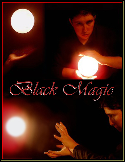
Hey, my two cents again: I find this a very well done shot. I find it balanced, moody and interesting. I think the blur of the hands and face is very appropriate motion blur, giving a sense of action. The red/yellow tones are also appropriate because this is black magic and with black magic, I assume, darkness and fire are predominant. The only thing that distracts me in this tryptich is a minor one: the shadow on your face in the lower photo.
Again--good work Mavrik! |
|
 Photographer found comment helpful. Photographer found comment helpful. |
|
|
05/07/2003 12:38:10 AM |
Hi from The Critic Club:
You have the unfortunate luck to be my first critic, so please keep this in mind.
First, I too see the triangle, and like the idea. But Im wishing there was also a face in the top left shot. Would balance it more, and take away some of the over brightness of the ball alone.
Second, I personally dont care for so much red in this. I know its to convey a feeling, and it does. But maybe I would have turned the red down just a bit. I like the bottom photo better than top right.
Third, Like the placement of the title, and the boarder adds to this shot.(Which is usually not the case)
All in all a good shot. Im anxiously awaiting your "How'd they do that"
Keep up the great work, and feel free to totally disreguard all of the above!!!
Anona Boyte |
|
| Photographer found comment helpful. |
|
|
05/05/2003 11:18:45 PM |
|
I don't mind the slight differences in the photos, but the "ball" in the upper left bothers me a bit also. I think if you just repositioned it about 1/2 the diameter of the light about 45 degrees down and right, and maybe reduce the size a touch, it would look more balanced. |
|
| Photographer found comment helpful. |
|
|
05/05/2003 07:06:53 PM |
Yes, i clearly see the triangle (one of my favorite shapes:)- perhaps it is not so much a matter of their positioning but the strong white (particularly in top left).
I like our deal! If my picture is one that you didn't care for in the least and gave a crummy score to, that won't be a problem. You can still give me constructive criticism by telling me what i could have done different to make the image more appealing/stronger for your liking. |
|
| Photographer found comment helpful. |
|
|
05/05/2003 06:40:47 PM |
Journey - thank you for the long and constructive comment.
Yes, deal.
1. My goal was to create a 'triangle' sort of composition with the balls of light - so that you had to look at each of the 3 pics in totally different areas to see what the triptych was about. You're probly right that the bottom one is too close to the left edge.
2. You are absolutely right here. I tried reshooting the top right - and the top left IS a reshoot - but I couldn't get EXACTLY what I wanted, as this is ME in the shot - and nobody to press the button for me and tell me where I'm off. lol
I'm looking forward to your glass image. |
|
|
|
05/05/2003 04:31:04 PM |
Mavrik, since you asked for critical feedback in the forum, i will do so. I see some flaws (my taste, mind you!) with the picture but that didn't prevent me from giving you a 10 because the mood the picture gave me was way more important than the flaws. Also, i called it a smooth presentation because so many submissions lacked a kind of unity (repeat images, breaking images up just for the sake of breaking them and meeting the challenge without having any real reason otherwise). There is also personal taste at work with voters (tough to please all customers): i saw the red skin tones and the grain as a creative means of adding to the magic and i appreciated it; many dpc voters don't like it and hence your score! And dpc voters generally do not like dark images. This is what i see as the flaws:
1. the bottom image is just very cool. It does create a compositional problem though: The white ball is a very distinct shape in this dark image and this white ball is sitting prominently twice at the left side of this image which forces my eye to the left and creates somewhat of a visual imbalance.
2. with the top right image the bottom edge is a little too sharp and well defined (same applies to a lesser degree with the right edge of the top left image). This mars somewhat the magic of the imagery just floating up out of the darkness. Perhaps you could have given these two images a bit more of a feathered edge so that they would blend in more smoothly and seamlessly with the black.
I appreciate your creative effort. Keep it up!
Now, i have spend a lot of time writing you this comment. And, i stress, this comment reflects totally my own opinion which you are free to totally reject.
For the glass challenge i'm submitting an image that i spent a lot of time on and it involves some compromises. It was the best i could do right now. How about you giving me a constructive criticism comment next week after the glass results will be out? I appreciate real feedback too. Deal? |
|
| Photographer found comment helpful. |
|
|
05/05/2003 02:22:19 PM |
Ok you want my honest opinion. I don't like this because of the red/yellow tones. The face on the upper right is way out of focus and to blurry. I do like the text and the way you put the lined the pictures. Maybe use more lighting and then make it black/white and then put some red/yellow tint to it. It would make the picture more clear and give you the color you want. Of course I haven't tried it so I am not sure it would work.
I did something similar with my "despair" picture. |
|
| Photographer found comment helpful. |
|
|
05/05/2003 12:42:02 PM |
Thanks Journey - I thought it would do well, too. I have given up on dpc voters. I flipped through a magazine today and know I've taken better shots than what was in there. It's about being hired.
Kiwi - I have a desk lamp in my lap facing the camera. It's a reverse of Stephan's picture "Edison's Gift." I wanted to recreate his shot, got playing around with the light bulbs and figured this out. ALL of these shots are dpc legal - I touched them up to make them more perfect, but the ball of light was in the original - as is. |
|
|
|
05/05/2003 03:08:14 AM |
|
Cool multi image Mav. You gonna tell me how you did it now? |
|
| Photographer found comment helpful. |
|
|
05/05/2003 01:14:11 AM |
|
Would have thought this presentation would have done a lot better! That's the black magic of dpc voters, i guess :) |
|
| Photographer found comment helpful. |
Comments Made During the Challenge  |
|
|
04/30/2003 09:15:27 PM |
|
Interesting use of light. Really has that Magic feel to it. I find the face and hands a bit too fuzzy. Still an effective shot. 7 Jacko. |
|
| Photographer found comment helpful. |
|
|
04/29/2003 04:00:10 PM |
|
Magic indeed. Fun to contemplate. Nice images, particularly with the reddish glow and the grain which all adds to the magic. Nice, smooth, and effective presentation. A real multi-image. 10 Journey |
|
| Photographer found comment helpful. |
|
|
04/29/2003 12:32:09 AM |
|
Looks like a poster from the 70's. Pretty good effects. |
|
| Photographer found comment helpful. |
|
|
04/28/2003 09:13:28 PM |
|
Nice. I think the border would have been better if it were only the red line. |
|
| Photographer found comment helpful. |
|
|
04/28/2003 12:57:51 PM |
|
I like the sense of action and motion here. The three images provide different views of "black magic" and the emotions that go with. This is really quality photography in my view. 9 |
|
| Photographer found comment helpful. |
|
|
04/28/2003 11:16:27 AM |
|
Kooooooool shot. Fantastic idea. |
|
Home -
Challenges -
Community -
League -
Photos -
Cameras -
Lenses -
Learn -
Help -
Terms of Use -
Privacy -
Top ^
DPChallenge, and website content and design, Copyright © 2001-2026 Challenging Technologies, LLC.
All digital photo copyrights belong to the photographers and may not be used without permission.
Current Server Time: 06/27/2026 07:12:13 PM EDT.