| Author | Thread |
Comments Made During the Challenge  |
|
|
07/05/2005 08:47:00 PM |
|
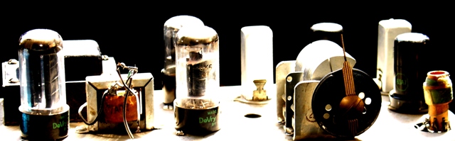
Like the choice of subject, and the cropping. |
|
|
|
07/05/2005 09:47:29 AM |
|
This is a neat picture, little over exposed. Nice subjects. I have to give this a 6 due to the subjects. Bet this is the only one in the challenge. |
|
|
|
07/05/2005 12:43:06 AM |
|
|
|
07/04/2005 08:51:57 PM |
|
it's an interesting idea, but very harsh light and overexposed. |
|
|
|
07/03/2005 05:02:32 PM |
|
Overbuned! exposition is far from ideal... |
|
|
|
07/02/2005 04:19:55 PM |
|
I like the composition and the layout, and think the idea is great. (We have a few of those amp things ourselves!) I do think that it's quite overexposed in several places, particularly the middle & tops. |
|
|
|
07/02/2005 01:54:02 AM |
|
|
|
07/02/2005 01:39:49 AM |
|
I was prepared to love this image based on the thumbnail. When I see it full size, I am disappointed by the blown highlights. Greater tonal range would have made this an 8-10 image for me. |
|
|
|
06/30/2005 08:18:51 PM |
|
|
|
06/30/2005 05:20:06 PM |
|
Exposure. The washout is distracting to me. I like the subject. |
|
|
|
06/30/2005 01:17:48 AM |
|
looks interesting, but overexposed in a lot of places |
|
|
|
06/29/2005 04:13:40 PM |
|
I like this concept of tubes. The hot spot in the middle of the image bothers me a bit. Try to photograph these objects with the lighting on the right and left side at about a 45 degree angle and I think this would be a better shot. Maybe if the objects were ganged together instead of separate. Ok enough nit picking. 7. |
|
|
|
06/29/2005 12:56:33 PM |
|
bit overexposed for my taste. |
|
|
|
06/29/2005 09:14:29 AM |
|
I wish this had different lighting. It looks harsh being so bright - almost washed out in places. |
|
|
|
06/29/2005 09:07:43 AM |
|
Whites are blown, softer lighting would have given a better result. |
|
Home -
Challenges -
Community -
League -
Photos -
Cameras -
Lenses -
Learn -
Help -
Terms of Use -
Privacy -
Top ^
DPChallenge, and website content and design, Copyright © 2001-2026 Challenging Technologies, LLC.
All digital photo copyrights belong to the photographers and may not be used without permission.
Current Server Time: 06/28/2026 06:53:44 AM EDT.