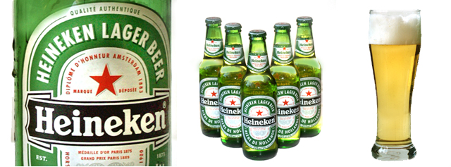
The strongest visual element in this image is the left hand close up on the bottle. My eyes draw left and focus on the details. The condensation on the bottle is a very good element. From that strong image on the left we move to a series of less compelling smaller images. The bottles in the center are interesting, but don't really add much to the overall image. I'd like to see a closer shot of the beer glass, maybe with the same level of detail...showing some of the bubbles from the foam?
It's got the beginnings of a great ad! You have a good title that clearly explains the shot. Nice work!
This is a great advertisement. Although not a beer drinker, i am originally Dutch, so i appreciate the Heineken (the French text was noted so i believe i know who you are) ! The presentation is nicely seamless and layed out in a logical manner. Love the droplets on the bottle; they help my eye wanting to go back into the picture instead of out. Really well done, 10 Journey
Love the middle image. nice symmetry. I\'d like to see the foam on the beer on the right more uniform (looks like it\'s been sitting there for a little while). The images work well together. Good luck. Jacko. 8
These pictures have an obvious tie together, but the composition doesn't really seem to flow together well. It feels unbalanced and somewhat random. Perhaps having the large bottle in the center and the multiple bottles on the left would have made the composition seem more even (and perhaps more sequential: 5 bottles, one bottle, glass). The shots in this series are each crisp and individually pretty well done, but they don't seem to form one cohearent composition here. 5
This really looks like a beer ad (you should pitch it to Heneken!) Very very well done, smooth and great transition, nice overll product. Your in my top 5! -10-
very nicely shot. i would have preferred to see borders between the three shots, but, as a photo w/out borders they seamlessly flow into each other and it looks very professional.
Nice lighting, great shots. I might be tempted to put the shot that centers on the word "Heineken" in the middle of the three, but that's probably just personal preference. Very nice work. 9





 Add photograph to your favorites
 Add photographer to your favorites

 Photographer found comment helpful.


