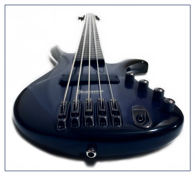
Well first I set this up with a white sheet in the background and set my 5-String Ibanez Bass on it and snapped about 40 photos of it from various angles and lighting. Then I took this one, made all of the white in the photo brighter to the perfect white to remove the background completely. Then I took the copied layer I made and blended it with the whitened layer to bring out the blue of the body of the bass. Then I fixed the shadowing because it was a little off, and the top right shadow wasn't there because it was resting completely on the sheet which was on a bed. After that I just did normal touch ups, which include levels, color balance to bring out the blue of the bass, NeatImage, and Brightness/Contrast.
Statistics
Place: 59 out of 275 Avg (all users): 5.9409 Avg (commenters): 7.2308 Avg (participants): 5.7132 Avg (non-participants): 6.2130 Views since voting: 1192 Views during voting: 322 Votes: 237 Comments: 14 Favorites: 0
There were a lot of guitar entries in this challenge - this was my favorite. The shadowing underneath the guitar is a little distracting though.
Curious - did you also try this shot with the focal point out near the nut? I don't know if it would have been more or less effective. Again, just curious.
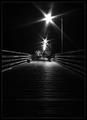
Leading lines or curves generally have two purposes. One is to lead the viewer into the scene. The other is to lead you toward the main subject. It is most effective if they come in from the lower left because that is the natural direction humans visually scan a picture from so are easiest to pick up.
Lines coming together direct attention to the main subject but you've cleverly accomplished this in the opposite direction.






 Add photograph to your favorites
 Add photographer to your favorites

 Photographer found comment helpful.


