| Author | Thread |
Comments Made During the Challenge  |
|
|
06/28/2005 03:01:51 PM |
|
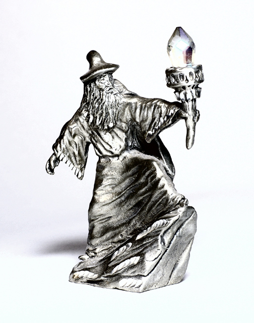
I think this image would have been greatly enhanced with a blue background. The white competes with the highlights, making the entire image washed out. |
|
|
|
06/26/2005 03:54:20 AM |
|
caveat: i'm a beginner. that said...i think this image is way too bright. |
|
|
|
06/25/2005 05:57:16 AM |
|
You turned it almost into a drawing, hard to see 'metal' here. I'll rate it a 4. |
|
|
|
06/24/2005 05:50:19 PM |
|
|
|
06/24/2005 01:41:13 AM |
|
The highlights are a bit overblown. Maybe toning down the flash or making some post processing adjustments will help. |
|
|
|
06/24/2005 12:31:51 AM |
|
Seems a bit over exposed to me. Not my fav subject matter.... |
|
|
|
06/23/2005 06:57:12 PM |
|
The wizard looks a little flat - perhaps the stright on lighting did this. A little more side lighting and it would add some depth I think. Good job with the placement on the background, but again, I think you could have cropped with the wizard to the left of the shot a little more to have him staring "into" the shot. Applying the "rule of thirds" here possibly would have made the image more interesting. |
|
|
|
06/22/2005 12:16:43 PM |
|
Doesnt scream "metal" to me like I think a challenge should. Nice though. |
|
|
|
06/22/2005 09:35:01 AM |
|
i think a blue or purple BG would have made the wizard stand out in this photo..still a 8 for me |
|
|
|
06/22/2005 12:37:41 AM |
|
Love the figurine. It would have been a nice touch to place him in some grass or against some natural background. For me the white is too harsh especially with the brightness on the wizard. |
|
|
|
06/22/2005 12:34:51 AM |
|
wow, at first glance he looks like he is just a sketching! technically smart, but i guess the main subject doesnt capture me. |
|
Home -
Challenges -
Community -
League -
Photos -
Cameras -
Lenses -
Learn -
Help -
Terms of Use -
Privacy -
Top ^
DPChallenge, and website content and design, Copyright © 2001-2026 Challenging Technologies, LLC.
All digital photo copyrights belong to the photographers and may not be used without permission.
Current Server Time: 06/29/2026 09:02:28 PM EDT.