| Author | Thread |
Comments Made During the Challenge  |
|
|
06/19/2005 06:37:03 PM |
|
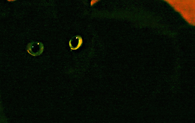
There seems to be a lot of green in the picture other than the eyes. I think a tighter crop would have increased the spookiness and got rid of the bright spots of orange on the right and top. |
|
 Photographer found comment helpful. Photographer found comment helpful. |
|
|
06/18/2005 03:06:52 AM |
|
Composition could have been improved by cropping out the red areas of the photo. The eyes are a lovely colour and appear to be nicely in focus. They really pop out of the image to grab your attention. There is a certain amount of low-level noise in the black areas which you might have been able to recover with careful use of levels/curves to make the 'almost-black' completely black. Composition is great with the eyes placed nicely off-center. |
|
| Photographer found comment helpful. |
|
|
06/17/2005 10:49:20 PM |
The red in in the upper corners cropped out leaving the eyes as the true subject.
Good shot most Cats eys reflect the Light even without a flash.
|
|
| Photographer found comment helpful. |
|
|
06/17/2005 05:22:57 PM |
|
| Photographer found comment helpful. |
|
|
06/16/2005 08:11:01 PM |
|
Wow those eyes! What's the top right? |
|
| Photographer found comment helpful. |
|
|
06/15/2005 10:38:05 PM |
|
This would be perfect if you had cut out all the red. Awesome eyes though! |
|
| Photographer found comment helpful. |
|
|
06/15/2005 02:30:03 PM |
|
Would be better to cut out everything but the black cat. |
|
| Photographer found comment helpful. |
|
|
06/15/2005 02:04:01 PM |
|
Love this one - I'm a sucker for cats and you have caught this one brilliantly. Pity abut the orange at the edge |
|
| Photographer found comment helpful. |
|
|
06/15/2005 01:00:33 PM |
|
wow!!!!!!!!!! very nice just you need to figure out the frame |
|
| Photographer found comment helpful. |
|
|
06/15/2005 12:15:47 PM |
|
great eyes. too bad that there is a red corner. |
|
| Photographer found comment helpful. |
|
|
06/15/2005 10:09:00 AM |
|
i would have cropped out all of the red(background behind cat). i think u have maybe too much green saturation but without the red BG it improves the overall photos feel.good luck 7 |
|
| Photographer found comment helpful. |
|
|
06/15/2005 06:51:26 AM |
|
Like the eyes - the gap to the red contrast appears a bit big for me |
|
| Photographer found comment helpful. |
|
|
06/15/2005 02:04:24 AM |
|
A tighter crop to get rid of the orange, and focus on those beautiful eyes could have been better, but good effort anyway. |
|
| Photographer found comment helpful. |
|
|
06/15/2005 12:08:45 AM |
|
Cool cat-eyes. You should have cropped the orange off of the side and top. That would have sent this image over the top. |
|
| Photographer found comment helpful. |
Home -
Challenges -
Community -
League -
Photos -
Cameras -
Lenses -
Learn -
Help -
Terms of Use -
Privacy -
Top ^
DPChallenge, and website content and design, Copyright © 2001-2026 Challenging Technologies, LLC.
All digital photo copyrights belong to the photographers and may not be used without permission.
Current Server Time: 07/02/2026 03:01:11 PM EDT.