| Author | Thread |
|
|
05/03/2003 01:29:03 AM |
Greetings from the Critique Club!
I concur with all of the compliments below!
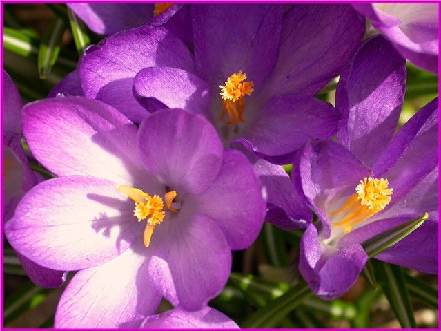
In this image, three croci grab my attention very quickly as the colors are so bright and lively. The cropping and composition work well for me because it seems as if they were apppropriately random, showing an almost candid shot of flowers--yet the photo is still balanced and the three flowers invite me to move my eye around the frame. In fact, the three flowers form a kind of circle that my eye really enjoys making over and over again. This photo gives me a feeling of happiness and peace--it's a celebration of exploding color and springtime. Very nice work!
To improve the shot, I can see only one thing that you might want to give more attention to: light. As I look at this photo, my eyes finally end up resting on the upper flower--that is where the most interesting light is. It gives definition to the flower, but it is gentle and even and builds a calm mood that speaks so clearly. Note especially how well the yellow of the stamens meat and is embraced so softly by the colors in the petals. The lower left flower has a harsher light. The flower on the right has better light, but its shape isn't as inviting as the top flower, though that's no reason not to include it, for we all enjoy variation. Someone noted below that they felt the darks were too dark and the lights too light. I think that it only has a few spots that are just a tad too bright. A diffusion of your light would probably have solved any lighting problems here.
The green leaves in the background also have interesting light, and really do a nice job of enhancing and grounding the brighter colors.
In sum, a wonderful shot. Focus and DOF work very well here, as does composition and cropping. You've obviously a great eye and have great skill in these areas. Lighting could perhaps be improved, so some experimentation with light may be a fun thing to do. This is a fine shot that you should be very pleased with. I've really enjoyed looking at it in more depth.
I look forward to seeing more of your photos in future challenges. Keep up the great work!
David |
|
 Photographer found comment helpful. Photographer found comment helpful. |
Comments Made During the Challenge  |
|
|
04/26/2003 09:13:56 AM |
|
Nice colours, but the 3 blooms compete for attention. The composition could be tighter. |
|
| Photographer found comment helpful. |
|
|
04/24/2003 09:53:06 PM |
|
As a gardener, i can relate to your title :) The top surprise tulip is nice. The overall lighting is rather uneven causing the washed out leaves in the lower left. 5 Journey |
|
| Photographer found comment helpful. |
|
|
04/24/2003 09:20:07 AM |
|
The color combinations here are awesome and mix so well together. The crop is tight but it works. |
|
| Photographer found comment helpful. |
|
|
04/23/2003 04:45:23 PM |
|
the purple and yellow contrast works very well in this shot... - setzler |
|
| Photographer found comment helpful. |
|
|
04/22/2003 02:28:10 AM |
|
Very uneven exposure - very over to very under exposed. Lots of detail in the background is also distracting. Beautiful colors really make this eye catching. |
|
| Photographer found comment helpful. |
|
|
04/22/2003 12:06:43 AM |
|
If this is crocus, don't be surprised: it often heralds spring before the tulips. |
|
| Photographer found comment helpful. |
|
|
04/22/2003 12:06:14 AM |
|
some contrast might help bring out the detials more.. maybe :o) |
|
| Photographer found comment helpful. |
|
|
04/21/2003 09:08:46 PM |
|
Nice contrasting colors and use of dof to catch the flower detail and blur out the green. The lighting is a little hard for my taste, though. |
|
| Photographer found comment helpful. |
|
|
04/21/2003 05:17:04 PM |
The lighting here is kind of akward, you have the very lit subject... and then the darker subject... I don't care for that. I think it might have been better if you had a different DOF, maybe gotten down and focused on the well lit subject with the dark ones sort of out of focus in the background? Just an idea... good focus though... glad you used three. I don't think there was a need for a border here... and especially not a purple one, but I'm not big on borders.
|
|
| Photographer found comment helpful. |
|
|
04/21/2003 04:07:35 PM |
|
this seems bith too dark and too light |
|
| Photographer found comment helpful. |
|
|
04/21/2003 11:18:39 AM |
|
| Photographer found comment helpful. |
Home -
Challenges -
Community -
League -
Photos -
Cameras -
Lenses -
Learn -
Help -
Terms of Use -
Privacy -
Top ^
DPChallenge, and website content and design, Copyright © 2001-2026 Challenging Technologies, LLC.
All digital photo copyrights belong to the photographers and may not be used without permission.
Current Server Time: 06/28/2026 02:37:44 AM EDT.