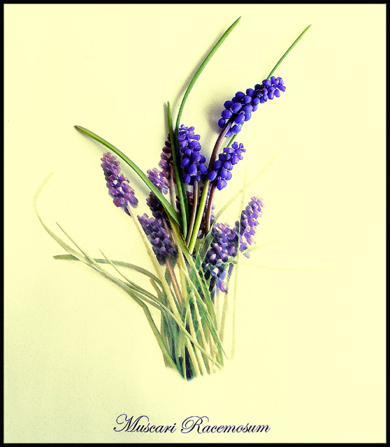
1. Took photo of flowers in question
2. Made it artsy with Photoshop filters, notably Dark Strokes and Rough Pastels
3. Added the latin name of the flowers.
4. Printed the sheet.
For the photo:
1. Added live flowers and leaves to image for photo.
2. Took the photo pretty much straight on.
3. Slightly adjusted saturation levels
4. Unsharp mask
5. Viola! Victorian Botany!
Statistics
Place: 31 out of 139 Avg (all users): 6.2302 Avg (commenters): 7.1429 Avg (participants): 6.2222 Avg (non-participants): 6.2500 Views since voting: 2254 Votes: 139 Comments: 43 Favorites: 8 (view)
Unreal shot. My faves list is reserved STRICTLY for shots I would be inclined to try out, or want to remember the technique. I remembered this shot, but not who did it. Glad to see it was you! :) (rather than say EFAFJSally49191029324 lol
You got me! The first time I looked at it I was perplexed, but then saw how you seamlessly blended the two elements together. This is not only a good idea but nicely executed. I like your lighting and colors here. Good job.
Choice set up. It has been judged as legal by the administrators so congratulations on a top photo! I find that you should have cropped a tad more from the right hand side, it seems a little unbalanced to me. I particualrly like effectiveness of the blues and greens on the yellow background.
Wonderful idea and execution. Im sure you had more than one person wondering how you did this. The placement of the real flowers on the print are perfectly laid out.
Oh, I see what you did. It's a picture of a painting with realflowers placed in the center going up. VERY CLEVER!!!! Took a while to figure it out and that's always fun. Excellent hob.
This is indeed the type of illustration/presentation you would expect in a botany book. And i like that look. But if that's what you were aiming for, methinks the bottom stems and right leaves should have been sharper as well. I'm not so keen on the yellowish background, white or grey would have been better imho. 6 Journey
Do not know what the issue was with this to warrent the Admin note. Looks like an arangement on a white sheet. A little washed out, but not bad, nonetheless.
Perhaps a little more depth of field would have been nice. Other than the top three blue/purple flowers, the rest looks kind of flat. Lovely arrangement though.
This has such a nice appeal but I keep getting distracted by the \\\"Muscari Racemosum\\\" written at the bottom. It gives this photo an appearance of being created solely in post editing. I debated how to score it and instead of being one of those close minded voters and vote it low cause I may be misinterputing it, I am leaving a comment and hoping I might be able to go back later in the week and revote on it by being able to understand how you acheived the entire look.
Thank you for answering my question now I have revoted on it and gave you a 10 and recognizing all the hard work that goes into this I wish other people would be able to openly ask questions when they aren't sure about a photo. =o)
I think you didn't read the rules clearly that states you can't put in extra words and you can't do spot editing. If this was done in camera, then I apologize for that statement. I guess I'm not very big on the lightness of parts and the brightness of others.. sorry.







 Add photograph to your favorites
 Add photographer to your favorites

 Photographer found comment helpful.


