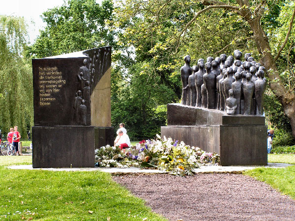
It is perhaps unfortunate that I cannot read the text of the monument which might hold a translated immediate and apparent link to the context of decision. Without that text, the image I see is one of respect, possibly mourning or remembrance, but I would not add a keyword like decision to the description of the photo's story.
The image itself is likable, seemingly balanced by the elements of foreground, center interest and then background, the flow caused by the positioning of the monument leads the eye through the story, but there are some fatal flaws that were probably introduced in compression, resizing and sharpening that detract from the whole. Jaggies on the angles and the white shirts in the center abound. The shirts and top of the flat monument seem way overexposed and the rest of the lighting seems to leave a less-than-3dimensional fell to the image. In this case, the only suggestion for improvement that I could offer would be to not sharpen the larger image beofre resizing and then only slightly sharpen once resized, or sharpen large and save, then undo the sharpen before resizing. This may have prevented the harsh contrasts in the areas where lighter objects halo'd into darker areas. I offer this image a 4. Weak challenge link, good design, harsh lighting and post processing. |