| Author | Thread |
|
|
06/07/2005 01:51:39 AM |
|
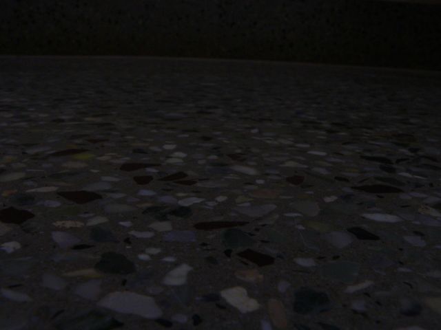
Sorry, turned out real bad on screen when compared to the shot on the LCD. |
|
Comments Made During the Challenge  |
|
|
05/31/2005 08:39:14 PM |
|
interesting idea, but the dark lighting downplays your "granular" element |
|
|
|
05/31/2005 03:32:51 PM |
|
|
|
05/31/2005 10:51:55 AM |
|
|
|
05/30/2005 09:43:31 PM |
|
Very dark, hard to see the details |
|
|
|
05/30/2005 07:25:43 PM |
|
Just can't seem to get the granluar aspect of this photo. Too dark perhaps. |
|
|
|
05/30/2005 05:12:27 PM |
|
|
|
05/28/2005 11:59:39 PM |
|
I'm not convinced this meets the challenge, and would prefer it was lighter. |
|
|
|
05/28/2005 08:07:52 PM |
|
I cannot figure out what you are trying to show in your entry. Maybe if it was a little bit lighter so we could see the mosaic and then we could better evaluate what you are showing. |
|
|
|
05/28/2005 04:26:55 AM |
|
Very dark and my monitor is calibrated. I can't really see what's going on here. |
|
|
|
05/28/2005 12:38:34 AM |
It s a bit too dark, we cant really see what s in the picture
or maybe it s just my screen |
|
|
|
05/27/2005 04:52:44 PM |
|
|
|
05/27/2005 08:01:24 AM |
|
I really cant see what this is a picture off. |
|
|
|
05/26/2005 09:14:37 PM |
|
Little too dark IMO. But it's better than having all the hot spots like in mine! Oh, well what can we do but keep practicing! |
|
|
|
05/26/2005 08:58:30 PM |
|
Needs to be much lighter to appreciate. |
|
|
|
05/26/2005 06:58:24 PM |
|
? I could barely see a thing on my screen |
|
|
|
05/26/2005 10:22:49 AM |
|
A teensy bit more light and this might be a bit more interesting...not a ton of light, just a little touch of drama would be nice IMO. |
|
|
|
05/26/2005 10:03:52 AM |
|
|
|
05/25/2005 06:32:39 PM |
|
just bad quality. this is so dark i can't even see if it is in focus. |
|
|
|
05/25/2005 05:16:38 PM |
|
|
|
05/25/2005 04:52:15 PM |
|
This looks like a beautiful pattern, but it is too dark for me to really be able to tell. |
|
|
|
05/25/2005 02:16:25 PM |
|
|
|
05/25/2005 10:44:57 AM |
|
Much too dark. No detail at all. |
|
|
|
05/25/2005 06:38:56 AM |
|
I think it's a little too dark |
|
|
|
05/25/2005 12:23:25 AM |
|
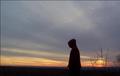
ahhhhh! Slanted horizon? People will complain. I have a bright monitor and this still seems a bit dark. |
|
Home -
Challenges -
Community -
League -
Photos -
Cameras -
Lenses -
Learn -
Help -
Terms of Use -
Privacy -
Top ^
DPChallenge, and website content and design, Copyright © 2001-2026 Challenging Technologies, LLC.
All digital photo copyrights belong to the photographers and may not be used without permission.
Current Server Time: 06/28/2026 10:13:57 PM EDT.