| Author | Thread |
|
|
04/24/2003 12:07:45 PM |
Critique Club:
Meets the Challenge: Excellent
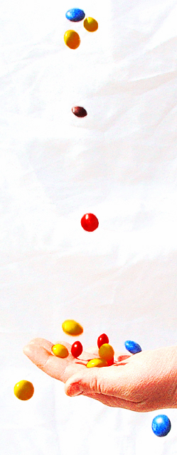
Composition: Very good use of empty space, the hand with the candy towards the bottom gives a good feel to the photo, as if it has a little bit of weight and strength at the bottom where it is needed, without detracting from the airiness (is this really a word?!) of the shot. I really don't mind the wrinkled sheet, as the candy is so flat, it adds a little bit of tonal contrast to the photo and I like that, despite the comments below.
Technical Quality: To me, (one person's opinion only), it needed to be a bit more abstract to be that. It looks grainy and oversaturated and overexposed and a bit out of focus for a realistic shot and not enough to be abstract. Since abstracts generally don't do too well in competion, you can work with this some more to make improvements that will make a great sellable print, since you can do some spot editing on parts and make it as surreal as you want!
Creativity: Excellent. And the added post-processing adds to the creativity of the shot.
Overall: A nice photo, I would have probably given it a 5 as it is, with a little more or less post-processing my score would have gone up.
Hope this helps, if you have questions or comments feel free to email or pmail me. Kandice |
|
 Photographer found comment helpful. Photographer found comment helpful. |
|
|
04/21/2003 12:17:34 AM |
|
Just checkin' out some of my faves for this week. This photo still makes me happy! |
|
| Photographer found comment helpful. |
Comments Made During the Challenge  |
|
|
04/19/2003 02:13:21 PM |
|
A bit overexposed, and many of the candies are a tad grainy, but this is a fun, lively shot with happy colors and captured movement, so it works for me very well. |
|
| Photographer found comment helpful. |
|
|
04/17/2003 08:10:13 PM |
|
neat comp here, the lighting is alittle distracting to me, good caption. |
|
| Photographer found comment helpful. |
|
|
04/16/2003 09:40:53 PM |
|
i like the highkey stylized quality of this. and the very vertical crop is cool. there are some distracting unironed sheet folds in the background or something .. |
|
| Photographer found comment helpful. |
|
|
04/16/2003 12:53:36 PM |
This is a really great idea! It's too bright, the hand is almost washed out and has some grain (look at the thumb-nail). Most of the candy's motion stopped, this is both good and bad - shows motion (good), some look blurred our almost "added" (not accusing you of cheating in any way). More candy might have been good.
7 Rob the Swash |
|
| Photographer found comment helpful. |
|
|
04/15/2003 03:03:11 PM |
|
Great concept...good execution. Colors/images could be shaper, but the idea is conveyed well! Good work! |
|
| Photographer found comment helpful. |
|
|
04/15/2003 04:34:09 AM |
|
This photo has a strange surrealism about it. Its very high key and everything is a little blurry. It really has the illusion of being a painting though, and a good one at that. |
|
| Photographer found comment helpful. |
|
|
04/14/2003 11:32:46 PM |
|
interesting piece. background should be a little less wrinkled, candy a little more in focus, but hand looks great. |
|
| Photographer found comment helpful. |
|
|
04/14/2003 07:50:15 PM |
|
this is so beautifully executed image...(but in my monitor, i noticed the harsh lighting, hmm...still amazing for me).. |
|
| Photographer found comment helpful. |
|
|
04/14/2003 06:47:24 PM |
|
Great shot. I like the angle and cropping. Very creative. Might be a little to much contrast. Good choice of colors & saturation. Good job. 7. |
|
| Photographer found comment helpful. |
|
|
04/14/2003 10:48:37 AM |
|
Nice vertical picture - I think it would be a bit better if it were a bit clearer, and the colours adjusted somewhat. |
|
| Photographer found comment helpful. |
Home -
Challenges -
Community -
League -
Photos -
Cameras -
Lenses -
Learn -
Help -
Terms of Use -
Privacy -
Top ^
DPChallenge, and website content and design, Copyright © 2001-2026 Challenging Technologies, LLC.
All digital photo copyrights belong to the photographers and may not be used without permission.
Current Server Time: 06/28/2026 04:45:03 PM EDT.