Concept: Nice idea, but composition detracts too much.
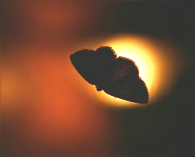
Composition: Good placement of subject and light, but very oof, with light streaming through the wings, hurting the challenge topic. Blur factor on background and subject make this seem very overprocessed on a ho-hum image.
Challenge: Almost. Too much light/detail in the subject.
I wish I had better comments for you, but the best way to learn is someone pointing out what could be done better in the future. The image is out of focus. You do have the right idea on how to create a silhouette... however, the bright spot of what appears to be a flashlight behind the moth is very distracting. This image also appears pixelated as if you tried to resize too much. Good luck in future challenges!





 Add photograph to your favorites
 Add photographer to your favorites


 Photographer found comment helpful.


