| Author | Thread |
|
|
07/16/2006 02:02:48 PM |
|
 Photographer found comment helpful. Photographer found comment helpful. |
Comments Made During the Challenge  |
|
|
05/17/2005 07:15:57 PM |
|
very nice and very pleasing to look at. Bump. |
|
| Photographer found comment helpful. |
|
|
05/17/2005 03:39:17 PM |
|
i like the view here, but the slightly skewed horizontal line isn't working as well for me. another nitpick would be the high contrast value. 9. |
|
| Photographer found comment helpful. |
|
|
05/17/2005 06:37:45 AM |
|
| Photographer found comment helpful. |
|
|
05/14/2005 07:36:11 AM |
|
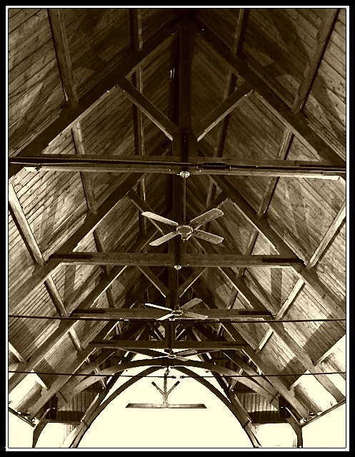
Nice use of sepia tones. It suits the subject. |
|
| Photographer found comment helpful. |
|
|
05/12/2005 11:57:25 AM |
|
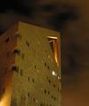
The triangle is strong at the top of the picture, but loses punch towards the middle because of all the other distracting elements (lights, wires, and the big white space at the bottom). |
|
| Photographer found comment helpful. |
|
|
05/12/2005 11:00:11 AM |
|
I think the light outside is too harsh and I don't know that I like the brownish tone to it. |
|
| Photographer found comment helpful. |
|
|
05/12/2005 03:10:07 AM |
Ohh, nice effect. What a great building and a nice image too!
|
|
| Photographer found comment helpful. |
|
|
05/11/2005 12:54:02 PM |
|
very cool image...good job. love the tones. i wonder if you could have totaly cropped out the sky section and still been good. Good luck |
|
| Photographer found comment helpful. |
Home -
Challenges -
Community -
League -
Photos -
Cameras -
Lenses -
Learn -
Help -
Terms of Use -
Privacy -
Top ^
DPChallenge, and website content and design, Copyright © 2001-2026 Challenging Technologies, LLC.
All digital photo copyrights belong to the photographers and may not be used without permission.
Current Server Time: 06/29/2026 02:39:38 PM EDT.