Author Thread
Post actions
Be nice. It's pretty. And I never liked the colour green, anyway...
Comments Made During the Challenge
Post actions
Satisfies the theme but not very interesting.
Post actions
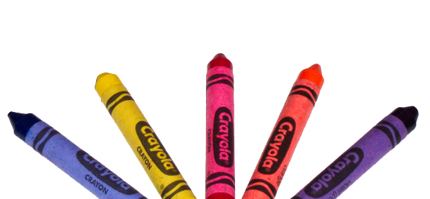
your missing green and if you want to get technical indigo
Post actions
croped a bit much, The whole crayon(s) would have been better
Post actions
too symetrical for my liking
Post actions
ehh.. ROYGBIV
Post actions
Post actions
Nice image. It looks a little bit fuzzy and out of focus. Good display of colors.
Post actions
I think you have chosen just the right level of saturation here to make the colors bright. The yellow crayon looks used. Is it? 7.
Post actions
why urban? (had to ask since i can't find much to suggest to improve the photo - nicely done). the symmetry could be just a little better.
Post actions
Very colorful and meeting the challenge head on. Maybe a little more sharpening would have highlighted the crayons more.
Post actions
Good idea, but the cropping detracts from the image.
Post actions
So many rainbows of crayons and colored pencils - this one is better than most.





 Add photograph to your favorites
 Add photographer to your favorites


 Photographer found comment helpful.


