| Author | Thread |
Comments Made During the Challenge  |
|
|
04/13/2003 11:46:06 PM |
|
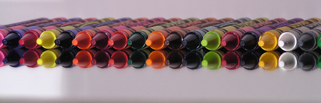
I love the reflection on the table. It looks good :) The only thing about the reflection that I don't like, which is probably hard to get rid of, is the reflecting light. Great job though :) |
|
 Photographer found comment helpful. Photographer found comment helpful. |
|
|
04/13/2003 07:11:56 AM |
|
Very nice to add the reflection. Good job. Jacko |
|
| Photographer found comment helpful. |
|
|
04/13/2003 12:58:43 AM |
|
great reflection and symetry |
|
| Photographer found comment helpful. |
|
|
04/12/2003 02:18:11 PM |
I like your picture a lot.
I just don't get the bottom left part.
:) |
|
| Photographer found comment helpful. |
|
|
04/12/2003 09:27:34 AM |
|
excellent! focus, clarity, rhythym, interest... |
|
| Photographer found comment helpful. |
|
|
04/12/2003 05:43:04 AM |
|
One of the better crayon shots. I like the use of the mirror on this one. |
|
| Photographer found comment helpful. |
|
|
04/11/2003 12:34:16 PM |
|
Great angle/composition. Could have been brighter. 7. |
|
| Photographer found comment helpful. |
|
|
04/11/2003 12:05:05 PM |
|
Just a bit dark. The colors do not stand out well. Perhaps if the entire background was white...like the portion to the left, it would have helped. |
|
| Photographer found comment helpful. |
|
|
04/11/2003 01:30:27 AM |
|
| Photographer found comment helpful. |
|
|
04/09/2003 11:44:54 AM |
|
| Photographer found comment helpful. |
|
|
04/09/2003 03:29:19 AM |
|
The white box, I guess it's a reflection, it pulls me to that spot. It seems to be a bit of a distraction. Nice placement and angle with the crayons. |
|
| Photographer found comment helpful. |
|
|
04/08/2003 10:22:32 PM |
|
Fantastic image. The dark stripe at the bottom is very distracting though. |
|
| Photographer found comment helpful. |
|
|
04/08/2003 01:04:14 PM |
|
Would've finished top 10 in symmetry, I think. :) Anyways - good use of color (not enough bright ones for my taste this week). Wish that white reflection was gone though. :( |
|
| Photographer found comment helpful. |
|
|
04/08/2003 10:08:26 AM |
|
| Photographer found comment helpful. |
|
|
04/07/2003 06:19:14 PM |
|
Needs stronger lighting. Also, taking the pic from a higher angle and zooming in a little might have been better. |
|
| Photographer found comment helpful. |
|
|
04/07/2003 12:08:11 PM |
|
| Photographer found comment helpful. |
|
|
04/07/2003 10:53:22 AM |
|
Neat shot, neat perspective, wish you'd of been a little close. It's good color. |
|
| Photographer found comment helpful. |
|
|
04/07/2003 10:20:14 AM |
|
| Photographer found comment helpful. |
|
|
04/07/2003 08:06:48 AM |
|
Excellent DOF. Your colors and lighting are really well done. -danny |
|
| Photographer found comment helpful. |
|
|
04/07/2003 06:25:54 AM |
|
I like this original angle. Good job |
|
| Photographer found comment helpful. |
|
|
04/07/2003 04:10:29 AM |
|
Good scene construction and point of view. but the exposition is too dark. |
|
| Photographer found comment helpful. |
|
|
04/07/2003 02:49:29 AM |
|
A common idea here but this one is nicely set up. |
|
| Photographer found comment helpful. |
|
|
04/07/2003 12:29:37 AM |
|
Maybe you could expose it just a little bit more. I liked the composition. |
|
| Photographer found comment helpful. |
|
|
04/07/2003 12:18:05 AM |
|
Great shot, only thing I might change is that bright area in the lower left. Good luck, 8 |
|
| Photographer found comment helpful. |
Home -
Challenges -
Community -
League -
Photos -
Cameras -
Lenses -
Learn -
Help -
Terms of Use -
Privacy -
Top ^
DPChallenge, and website content and design, Copyright © 2001-2026 Challenging Technologies, LLC.
All digital photo copyrights belong to the photographers and may not be used without permission.
Current Server Time: 06/30/2026 06:34:05 AM EDT.