| Author | Thread |
|
|
04/20/2003 03:42:04 PM |
Greetings from the Critique Club :)
Hi Inga...
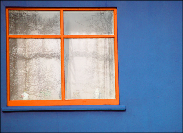
Your 'color' is very strong in this image... the orange and blue contrast with a lot of force. I particularly like 'window' photos and this is no exception. I think you have a good eye to have noticed this opportunity for the challenge.
Simplicity makes beautiful photos. There is a lot of charm here and the simplicity contributes a lot to that.
I can't really offer any suggestions for improvement on this image. There is nothing about it that I would change. I like what I see :)
Keep up the great work :)
John Setzler
|
|
Comments Made During the Challenge  |
|
|
04/13/2003 05:37:44 PM |
|
The colours are wonderful. I also like the simplicity. The window set so far into the top left, however, makes for a somewhat forced composition. I'm also left hungry for either a stronger reflected tree (off the glass) or no reflection in lieu of curtain texture (folds, creases, detail). |
|
|
|
04/13/2003 05:18:27 PM |
|
Simple, but I like it. Nice colors, I think a different composition would have been better, one in which the window frame is not so close to the edge. |
|
|
|
04/13/2003 12:37:27 AM |
|
|
|
04/12/2003 03:26:29 PM |
|
I love the blue/orange/white colour scheme. I also very much like having the square window to one side of the rectangle. The reflected trees give it life. Good job. |
|
|
|
04/11/2003 05:02:56 PM |
|
Nice colors (can't imagine what the house looks like). I especially like the reflections in the window, but also being able to see the bottles if you look closely. |
|
|
|
04/11/2003 01:43:19 PM |
|
|
|
04/10/2003 02:37:58 PM |
|
Nice contrast clolours and the reflection on the window tells something to the photo. Dreamy |
|
|
|
04/10/2003 09:04:14 AM |
|
nice muted colors, good contrast, interesting reflection, like a combination of black and white with color picture... very good. |
|
|
|
04/09/2003 11:11:59 PM |
|
|
|
04/09/2003 11:40:47 AM |
|
|
|
04/09/2003 12:11:28 AM |
|
LIke the blue and orange set off with the black and white. I think it would have added to the image if oyu had squared yourself up with the wall and window. I like the tight crop, but it points out the out of square. |
|
|
|
04/08/2003 03:11:46 PM |
|
I like that it's off centered. I don't like that it's not level or that there are a lot of distracting reflections (try polarizer?) |
|
|
|
04/08/2003 08:27:14 AM |
|
Nice vivid blue and orange here, and you used the negative space well. |
|
|
|
04/07/2003 09:58:19 PM |
|
|
|
04/07/2003 08:18:03 PM |
|
the window is slightly titled, but orange and blue are a great choice for colours that complement and brighten each other. I like how the trees are reflected on the glass, as if it is the outside looking out again. oh! and to be as helpful as possible, I also think it was a good call to have the window off to the left (rule of thirds?) - 8 |
|
|
|
04/07/2003 05:49:59 PM |
|
Composition is quite interesting, visually, and the color contrast works well. It appears as though there is perhaps some distortion in your lens (the top of the window is square with the rest of the frame, but the left edge and bottom are not) that detracts from the overall impact, in my opinion. Overall, though, quite nicely done! |
|
|
|
04/07/2003 03:24:05 PM |
|
|
|
04/07/2003 10:43:05 AM |
|
Home -
Challenges -
Community -
League -
Photos -
Cameras -
Lenses -
Learn -
Help -
Terms of Use -
Privacy -
Top ^
DPChallenge, and website content and design, Copyright © 2001-2026 Challenging Technologies, LLC.
All digital photo copyrights belong to the photographers and may not be used without permission.
Current Server Time: 06/28/2026 03:23:49 AM EDT.