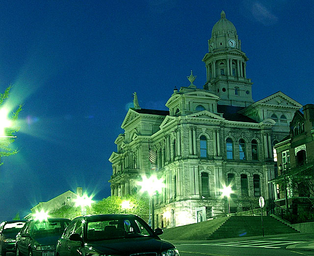
Well, I agree, this would have been a stronger image without the cars. But, I never had the chance to reshoot it and did not realize it when I was on site... Thanks for all the comments!
I love the courthouse, but to be honest, the cars detract from the image a bit. They distract from the subject, I guess, and don't fit in with the ornate stone theme. Also there's quite a bit of noise in the sky. But I really like the courthouse, did I say that? ;)
The right side of this photo adds nothing to the rest of the image which is interesting with unusual lighting. The image (IMO) would be stronger cropped square, cutting it off right behind the foremost car. Often the obstackles to a good photo are difficult to overcome, such as flood lights, which you dramatized by the added sharpening. I like it on the building, not on the lights or the cars. A couple steps difference in angle (if possible) would have made a huge difference.
The courthouse is a beautiful building and the color here is fantastic, but you could have captured those two elements without the cars. They really take away from the shot. Also, had you been closer to the building, you would have been further away from those very bright street lights, and would have ended up with even better lighting, and less or no lens flares. Not sure if you used a lens hood, but if you didn't, they really eliminate a lot of flares, and improve on the contrast of the photo.
Surreal, slanted, with overdone light flares, but strangely attractive regardless. I particularly like the way the blue in the windows matches the sky. The visible noise mars the image slightly.
I don't really care for the green cast here. The photo also tilts to the left, this can be straightened out in PS, and the street lights are to hot. I wonder what this photo would look like in B&W. Keep shooting. Other than that I like the subject of the photo and how you have it off center.
magnificent building and I like the colors, would be a lot better without mundane cars and "half-light" in front (couldn't you just make a few steps forward?) and with vertical corrected (or tilted stronger for an "artistic effect")
nice capture. the flare from the light on the left edge of the shot is rather distracting. I would have blocked it physically by standing between it and the shot (reframing angled a bit to the right, naturally) or shot from elsewhere. The color balance is very green for what I think it should be.





 Add photograph to your favorites
 Add photographer to your favorites


 Photographer found comment helpful.


