| Author | Thread |
Comments Made During the Challenge  |
|
|
05/03/2005 07:33:49 PM |
|
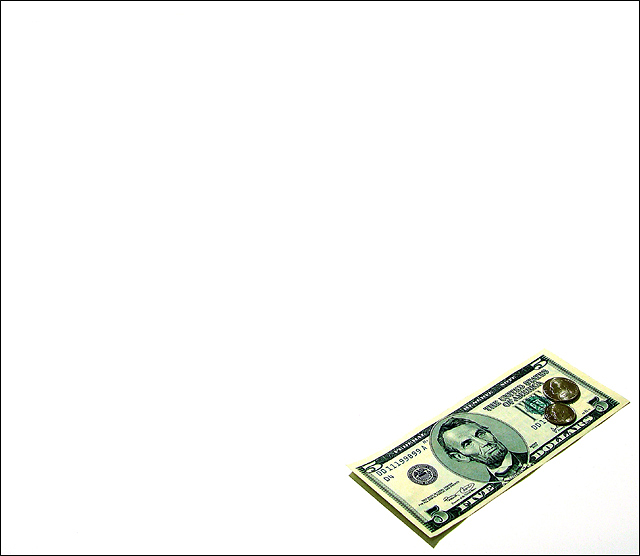
very crisp image. I think it is the USM tool. :) I like it. |
|
 Photographer found comment helpful. Photographer found comment helpful. |
|
|
05/03/2005 07:03:13 PM |
|
Thats unfortunate, in CA we get 6.75, but then again we also have a higher cost of living. You should have photographed the equivilent in Yen, Euros, or shillings because there are other money ones out there. |
|
| Photographer found comment helpful. |
|
|
05/03/2005 03:32:28 AM |
|
I wonder how many people here will understand the allusion. The harsh, directional light washes out the bill's texture and casts an odd shadow. |
|
| Photographer found comment helpful. |
|
|
05/02/2005 11:19:48 PM |
|
funny or sad... - intersting framing |
|
| Photographer found comment helpful. |
|
|
05/02/2005 11:04:04 PM |
|
I like the contrast and high key aspect of the shot. Nice placement of the coins as well. 10 |
|
| Photographer found comment helpful. |
|
|
05/02/2005 09:51:40 AM |
|
I like the simplicity of this idea, the overshatpening of the notes a coins is for me a slight distraction |
|
| Photographer found comment helpful. |
|
|
05/01/2005 11:25:25 PM |
|
Great concept -- color seems a bit too saturated. Top 20 in my book. |
|
| Photographer found comment helpful. |
|
|
05/01/2005 03:04:27 PM |
|
That minimum wage sure needs to go up! Very clear, great title. |
|
| Photographer found comment helpful. |
|
|
05/01/2005 12:23:52 PM |
|
Crisp! With the title it conveys a message, though I think the message might have been more poignent with a less-new bill and perhaps some context other than the white void. |
|
| Photographer found comment helpful. |
|
|
04/30/2005 07:58:03 PM |
|
This is one of the better "white background" pictures I have seen. |
|
| Photographer found comment helpful. |
|
|
04/30/2005 12:09:17 AM |
|
| Photographer found comment helpful. |
|
|
04/29/2005 02:37:51 PM |
|
|
|
04/29/2005 06:29:51 AM |
|
Clean and simple. Very well done. |
|
| Photographer found comment helpful. |
|
|
04/29/2005 04:51:35 AM |
|
great idea... love the angle and position you have placed the money... 9 |
|
| Photographer found comment helpful. |
|
|
04/29/2005 12:35:59 AM |
|
very cool, I would like to see a stack or two of coins beside the bill to add some depth. colours look great |
|
| Photographer found comment helpful. |
|
|
04/28/2005 07:19:43 PM |
|
Nice image, but I don't get the title. Is this a minimum wage reference? |
|
| Photographer found comment helpful. |
|
|
04/28/2005 02:46:31 PM |
|
minimum wage, great shot, nice idea. the bill seems very crisp and i like the shadow. 8 |
|
| Photographer found comment helpful. |
|
|
04/28/2005 07:52:44 AM |
great lighting.
nice background. well done |
|
| Photographer found comment helpful. |
|
|
04/27/2005 01:59:55 PM |
|
Love the statement you're making here...sad isn't it? |
|
| Photographer found comment helpful. |
|
|
04/27/2005 01:06:03 PM |
|
I like the image and the message it conveys. Nicely done. |
|
| Photographer found comment helpful. |
|
|
04/27/2005 12:14:10 PM |
|
I don't know why, but for some reason this lacks depth. Great idea. |
|
| Photographer found comment helpful. |
|
|
04/27/2005 11:06:41 AM |
|
I like this....kinda gives you the feel for just how little small change is. |
|
| Photographer found comment helpful. |
|
|
04/27/2005 10:21:58 AM |
|
Theres obviously some hidden meaning to your title, which I don't understand. Maybe because I'm not from the US. However the image itself is nice enough |
|
| Photographer found comment helpful. |
|
|
04/27/2005 09:50:58 AM |
|
| Photographer found comment helpful. |
|
|
04/27/2005 08:52:13 AM |
|
or one day, for some of us :) nice, clean. 6 |
|
| Photographer found comment helpful. |
|
|
04/27/2005 01:39:24 AM |
|
right side of bill appears more burnt or yellowish on my screen...gl |
|
| Photographer found comment helpful. |
|
|
04/27/2005 12:09:24 AM |
|
the bill looks too yellow |
|
| Photographer found comment helpful. |
Home -
Challenges -
Community -
League -
Photos -
Cameras -
Lenses -
Learn -
Help -
Terms of Use -
Privacy -
Top ^
DPChallenge, and website content and design, Copyright © 2001-2026 Challenging Technologies, LLC.
All digital photo copyrights belong to the photographers and may not be used without permission.
Current Server Time: 06/28/2026 05:40:18 AM EDT.